Lettering 2024
A series of lettering pieces done through that year, mainly by using procreate.

⚫ "Nancy" — "Flat 3D" lettering piece inspired by a visit to the baroque city of Nancy in autumn 2024. The symbols on the corners were inspired by some stone carvings seen in the city (see next post) while the letters where inspired of course by Place Stanislas but also by several ornaments around the city. Software used: Blender, Glyphs, Illustrator, After Effects. (November 2024).
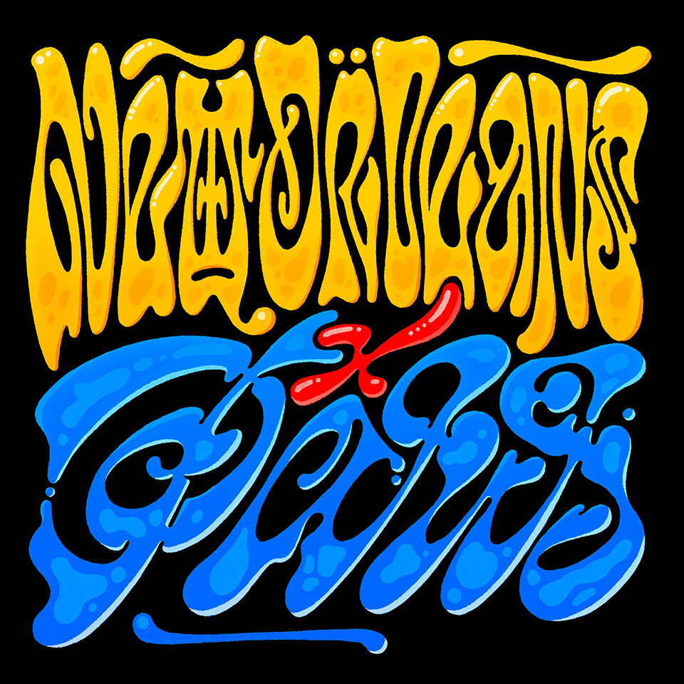
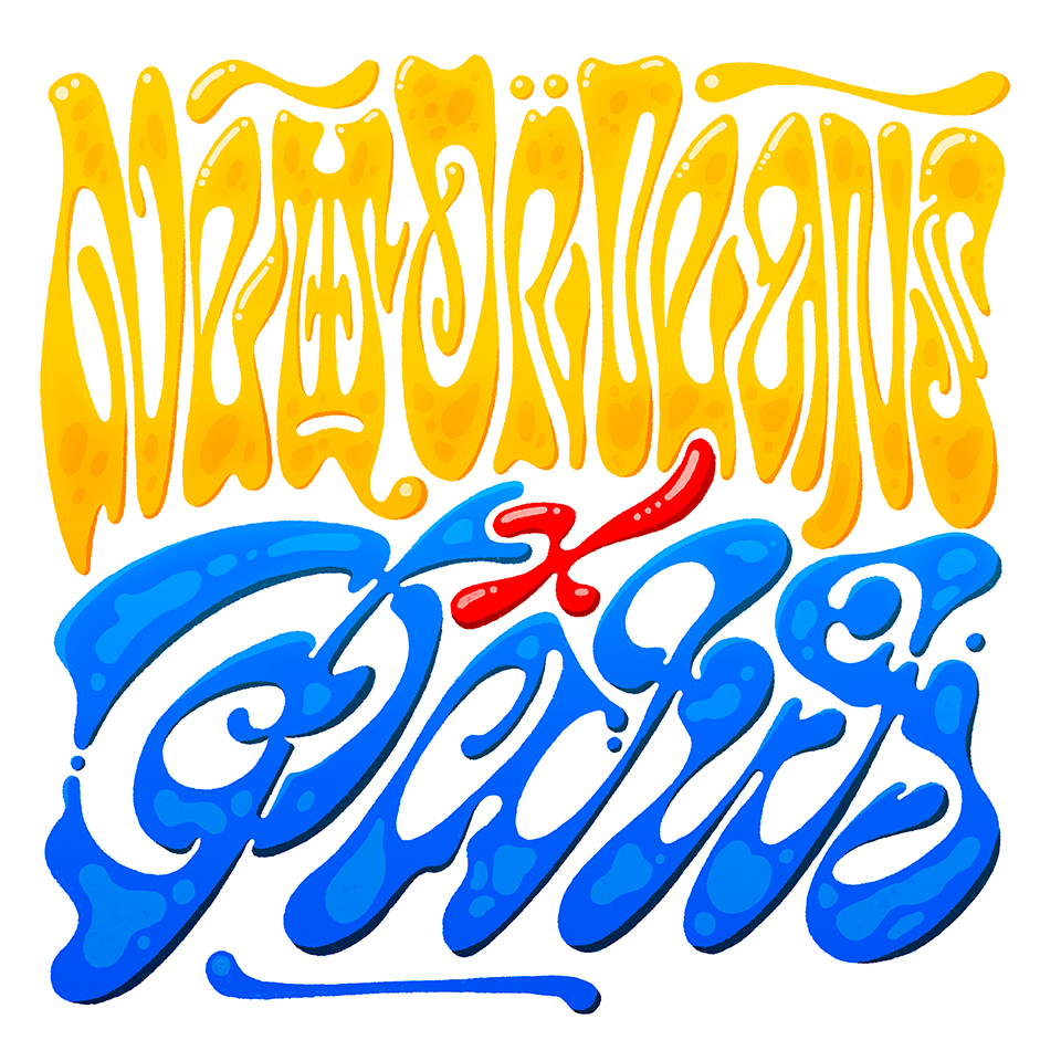
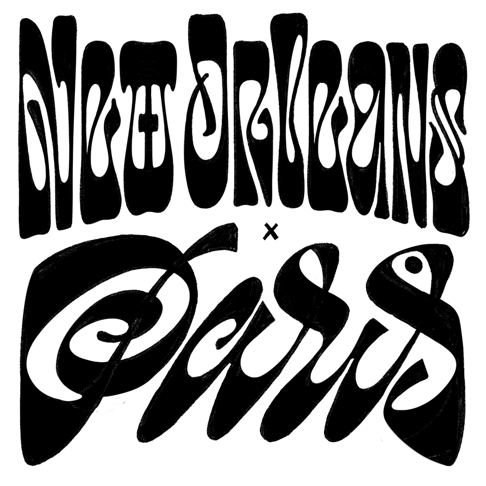
New Orleans VS Paris
Lettering collaboration with Matthijs Herzberg of the Herzberg Design Co. The idea behind this collaboration is that we sent each other lettering sketches and then we could render them any way we wanted. I chose to make the art nouveau letters of "New Orleans" even more unreadable and to make everything look more liquid. The colours of honey, blood and water were combined for the final composition. Matthijs Herzberg's original sketch is also shown here.
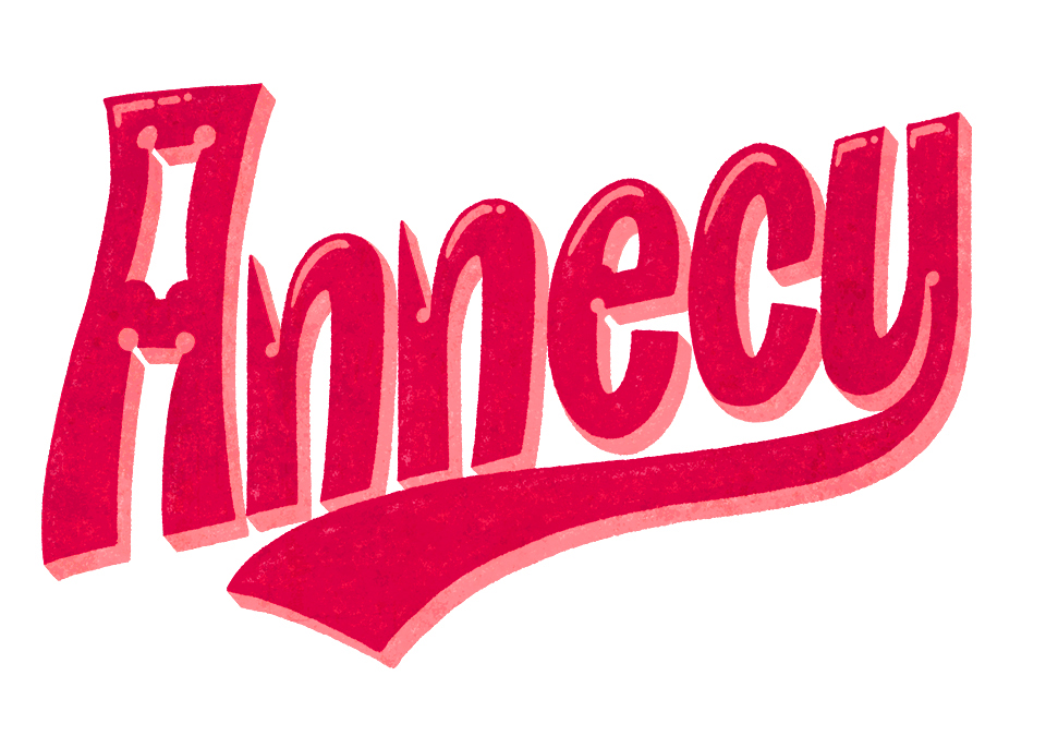
Annecy
Neo-medieval take on the name of this beautiful city on the east of France.
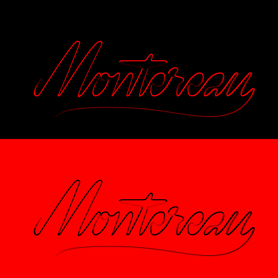
Montereau
A linear lettering hommage to Montereau-Fault-Yonne, drawn in Glyphs and 3D-modelled in Blender, with some cenital sun-like light effects. In November 2024 I had the pleasure to give a type design workshop at the lycée Lycée André Malraux located in this French city.
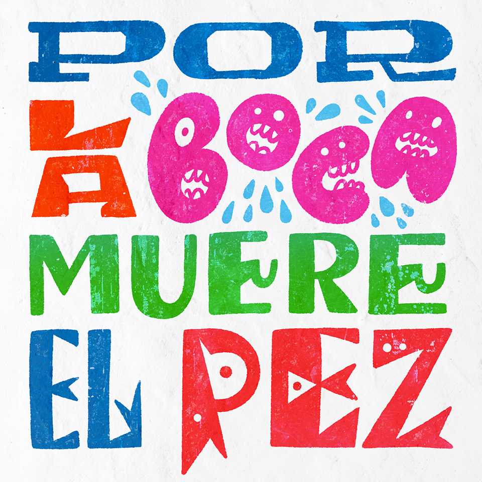
Por la boca muere el pez
One of my favourite Spanish sayings rendered as a wall painting, with E's sporting bars that look like hooks (you get it?).
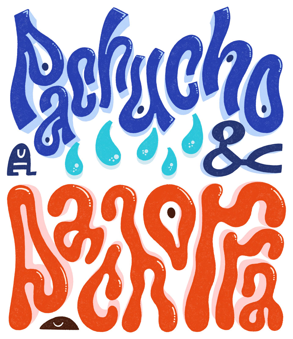
Pachucho & Pachorra
Two of my favorite words in Spanish! Featuring super-droopy letters, with "a"s looking like they're slouching down.
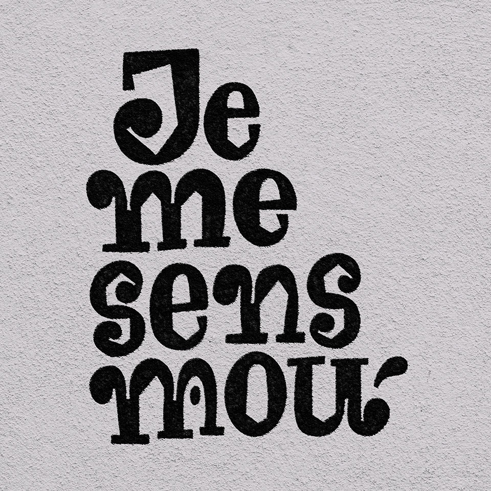
Je me sens mou
Je me sens mou (I feel weak) - one phrase that comes often in conversations with type designers on Telegram :) In this particular piece there's a displacement map effect that alters the lettering according to the texture of the background. There's also a certain play between the shapes and the counters of the letters.
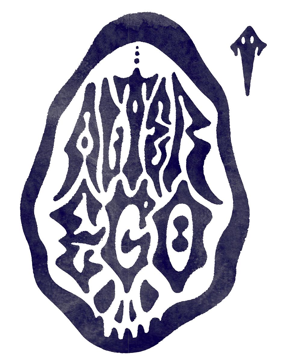
Alter ego
Sometimes, there's an enemy within us. Lettering piece including a bifid G and a goat-eye O.
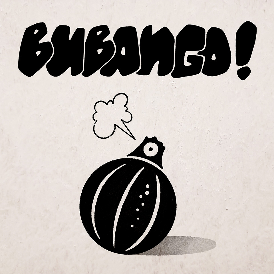
Bubango!
BUBANGO is one of my favourite words in the Canarian way of speaking. It is a type of courgette that is quite round and has a very mild flavour. I have combined an illustration with graffiti-style letters; I am very interested in the fact that in graffiti the letters often touch each other, whereas in typography they tend to be distant. I think there is a lot of graphic potential in the design of overlapping letters.
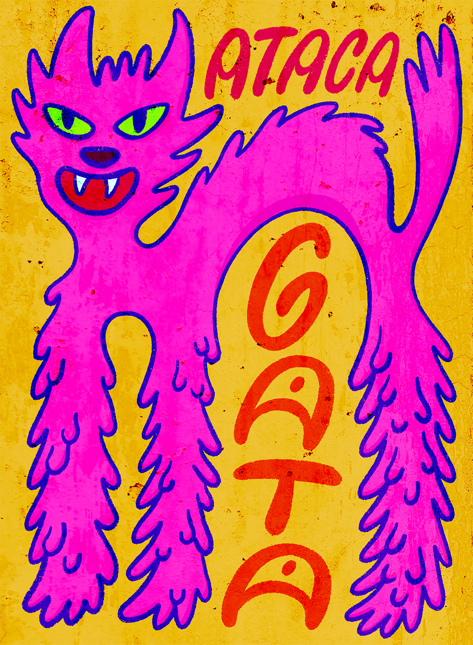
Ataca gata
Lettering and illustration piece based on some misheard Arca lyrics (the original says "ataja gata").