I'm Ariel Martín Pérez, an Art & Type Director.
I'm the founder of the Tainome ◌ design studio.
I'm also part of the open source type foundries Velvetyne √ (core member since 2018) and Tunera ∂ (that I founded in 2020). You can read my full CV here.
This page contains an ongoing archive of my personal art. You can support my work on Ko‑fi ‰ or send me an email ✉.
Esta página web se encuentra disponible en español 😶. Par ailleurs, ce site web est disponible en français 😶.
My recent projects:
⚫ "ASCII Art tutorial" — An in-depth tutorial about all there is to know for making ASCII art, from encodings to art styles to presenting ASCII art online and on print form (June 2026).
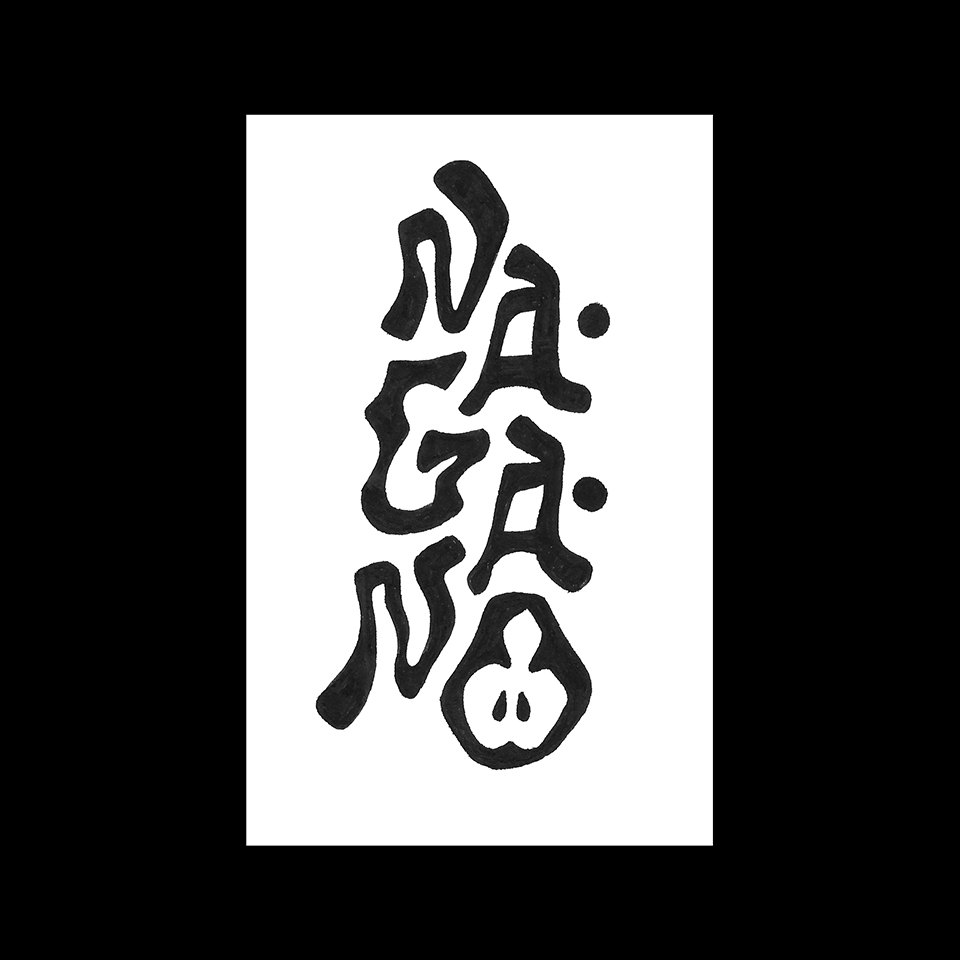
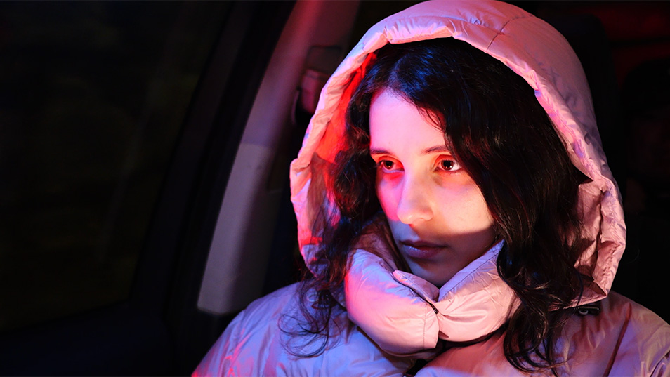
⚫ "NAGANO" - lettering piece inspired by the city of Nagano (where I ate the best apple of my life, of a variety called "lune rouge") and by Japanese wood-carving. Fudenosuke brush on food-grade paper(January 2026).
⚫ "25 tracks for a quarter of the century" — A personal selection of 25 electronic music tracks that I think are essential for explaining the evolution of the genre during the first quarter of the 21st century, plus some notable contenders (January 2026).
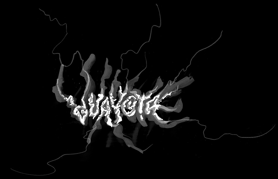
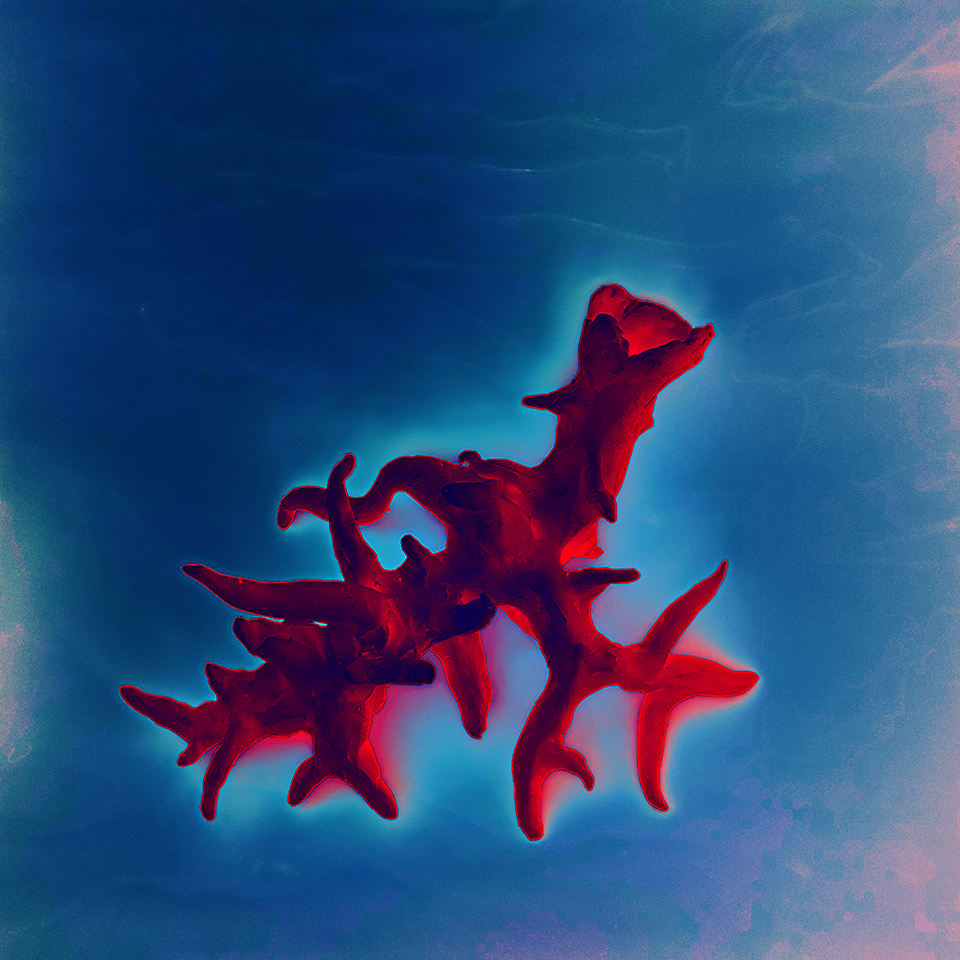
⚫ "Guayota" — Guayota is the main evil entity of the ancient inhabitants of the Canary Islands. According to some sources, it dwells (or has been trapped) inside the Teide volcano, which is what I have tried to represent in the ambient of this animation. The lettering was drawn by hand with tempera, tracing paper and pencil, and then imported to Blender, where the same image was used as a depth map to give it volume. The animation was created in After Effects and the sounds were recorded purposely for this video (January 2026).
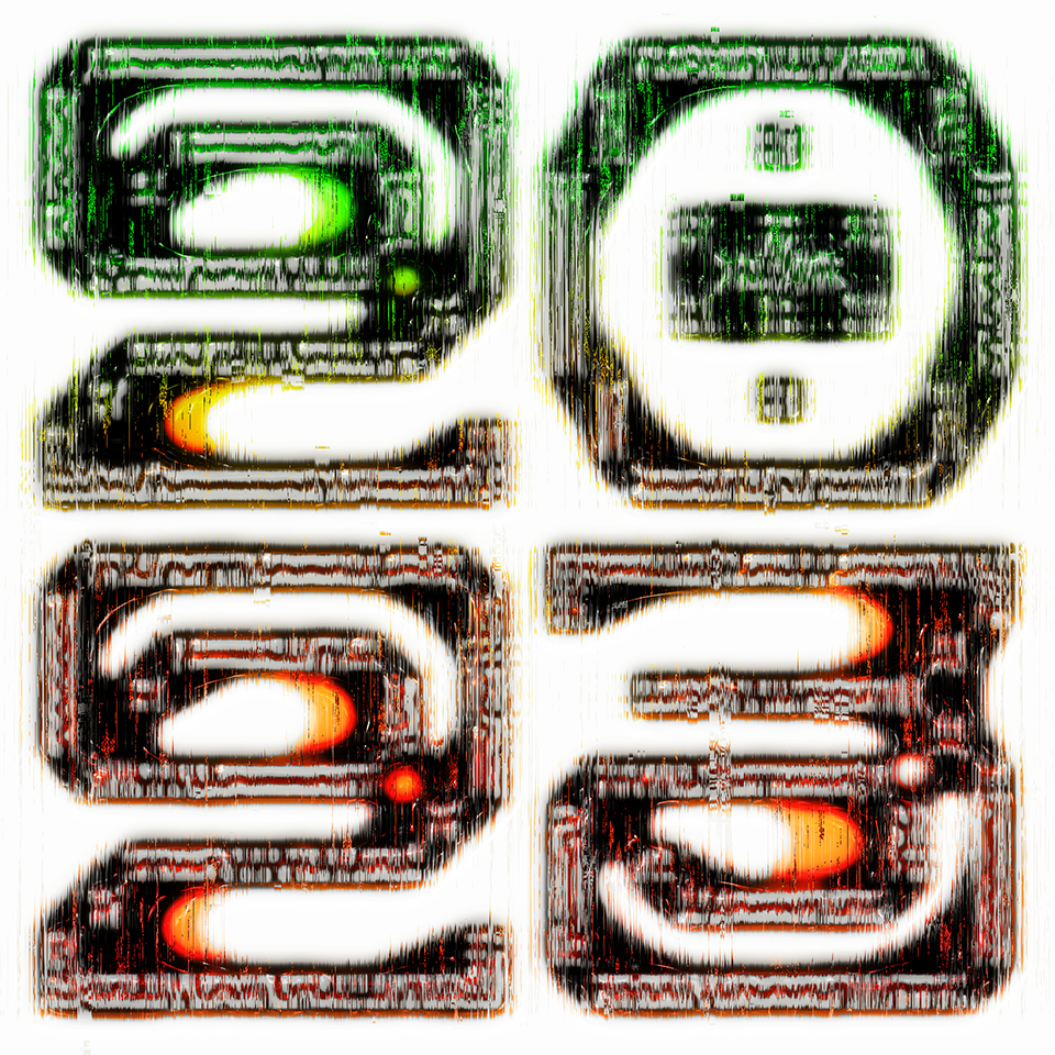
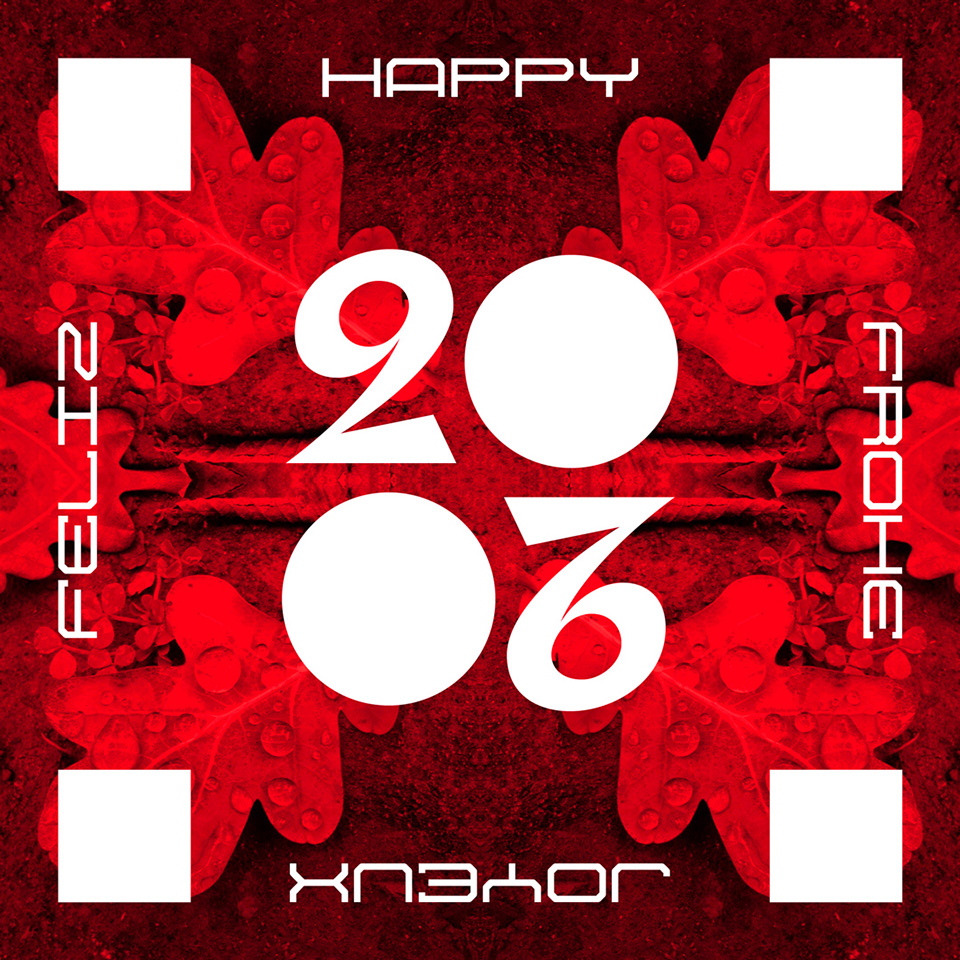
⚫ "Vœux 2026" — 2026 × 2026 equals 4,104,676. That's a lot. And yet it's less than the number of seconds in a year (31,536,000). We spend far too many of those seconds opening applications, checking emails, liking photos on the internet. Each of these actions only takes a few seconds, but when you add them all up, it amounts to hours and even days. So I've decided to spend less time drawing on the computer in 2026. It's totally perverse that the tool many of us work with every day is also a formidable entertainment machine, don't you think? Distraction is always there, lurking in the corner of the screen, the devil in the pixels.
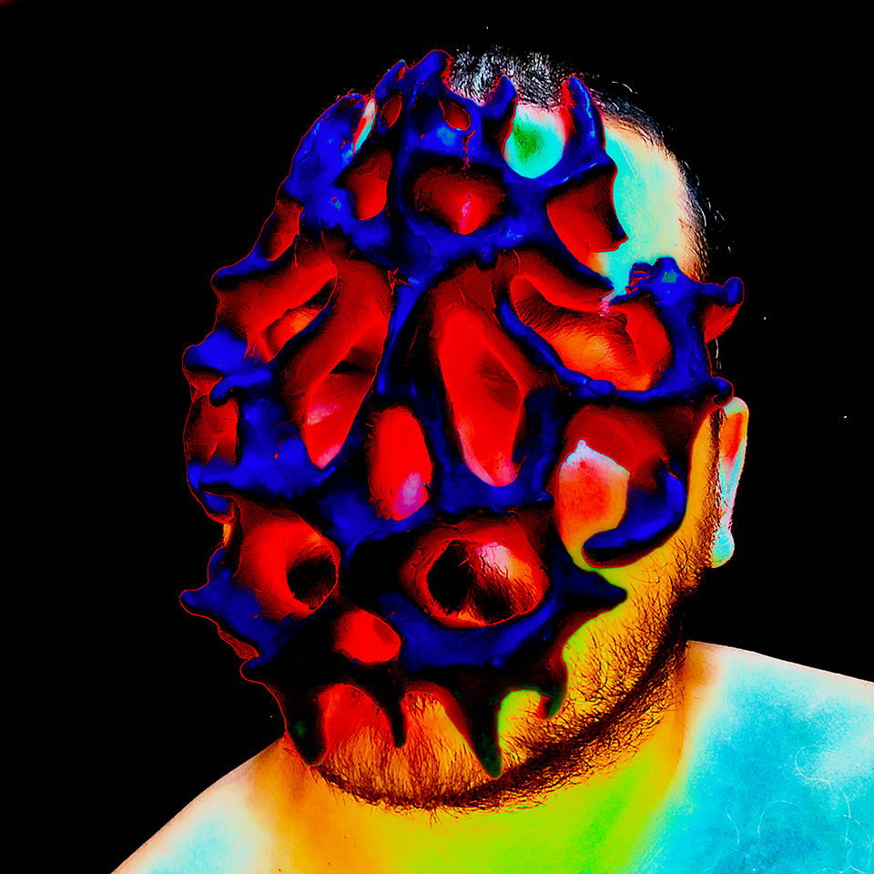
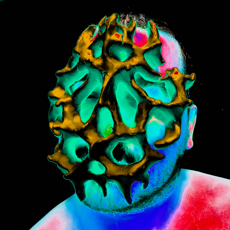
⚫ "Sweat" — brutalist 3D lettering piece. Brutalism is a design and architecture movement that's known for its use of materials like exposed concrete and for its massive, geometrical, functionalist shapes. But one of the things that makes an object or building "brutalist" is a certain honesty in the use of materials, without trying to conceal or divert them from their look. Applying this logic, gold or even wood objects can be brutalist if they're used without artifice. In this lettering piece, the seams that make up the 3D mesh have been revealed, showing the structure beneath. In this sense, I think that it's a brutalist piece of lettering (June 2024 - October 2025). An alternative version of this piece can be seen on the Lettering 2025 page.
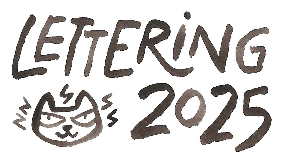
⚫ "Lettering 2025" — custom lettering pieces from 2025.
⚫ "Pixel Art 2025" — pixel art pieces done through 2025 in various formats.
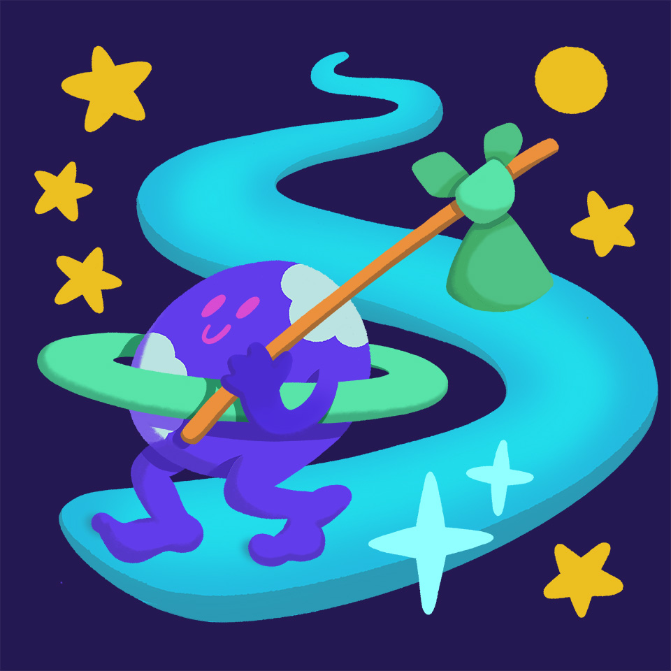
⚫ "Planet" — One year after this idea started circling in my head, I could concretize my illustration for the concept of "planet", from the Greek "planḗtai" ('wanderers'). The ancient Greek were puzzled by the seemingly erratic trajectories of these celestial bodies, that were very difficult to understand for them given that they believed in geocentrism. For the character illustration, I wanted to work on the "walking earth" trope, but I didn't feel at ease with the tradiotional cartoon treatment, so I had to bring it to my style (October 2025).
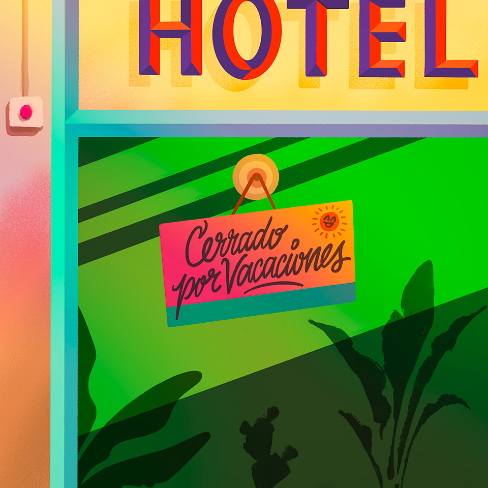
⚫ "Hotel - cerrado por vacaciones" — Lettering illustration based on a funny sign that I saw, on the door of a hotel which was closed for holidays (August 2025).
⚫ "ASCII Art 2025" — Textmode pieces composed with my own Sligoil typeface, which you can get for free over at Velvetyne. Contains one nude picture.
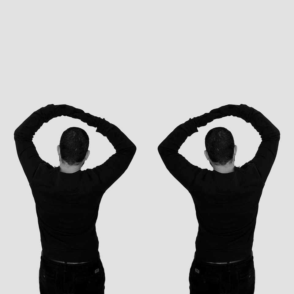
⚫ "Doomscrolling" — Sometimes, when I'm scrolling social media, my head feels like a Pachinko machine, with emotional balls bouncing between states of intense sadness, anger, boredom, joy and desire; always looking for the next dopamine hit.
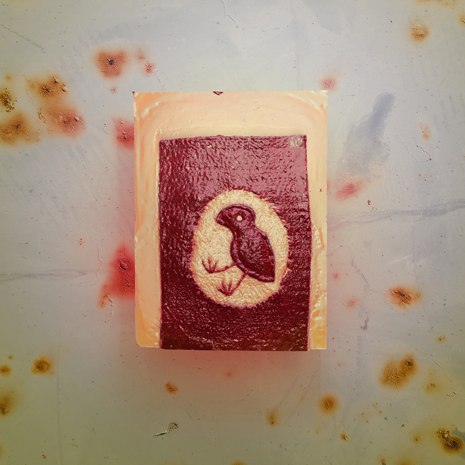
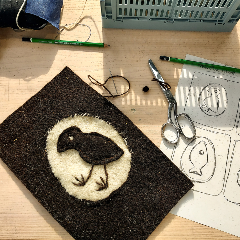
⚫ "Pajarrako" (baby crow) — A continuation of my explorations of image creation at the intersection of physical and digital media; I like to be able to change the material aspect of an object like in a game of virtual alchemy. In this case, I designed and assembled a felt piece featuring a bird, in a workshop conducted by Théophile Peris. Later, I 3D-scanned the felt piece with my mobile phone and modified it on Blender so I could change its material and light settings, I also incorporated one of my photographs on the background. I then combined two images on Photoshop to create the final picture. There are still Blender methods I'd like to delve deeper into.
Other than that, the original felt piece is probably one of the art projects I've done with the shortest ideation phase, I only spent some minutes deciding on the design of the bird, as much of the workshop was dedicated to cutting the felt and sewing the pieces together. Thanks to Théophile!
⚫ "Oligarch Pool Date Game" (sic) — These visuals where created for the 3rd Nokia Art Jam, an annual open call for pixel graphics that look like they could belong to an original Nokia. This year, there was an additional theme which was "What is James Bond Playing?", along with a picture of Agent 007 in the backseat of a car giggling and looking at a Nokia phone while another car explodes in the background. I'm not a fan of James Bond and I haven't watched most of the films, so I got inspired by my recent reading of "The Wizard of the Kremlin" novel by Giuliano da Empoli and by several of its topics.
The idea behind this imaginary game is that you have to successfully flirt with one of various oligarchs in order to complete your assigned mission, before the time runs out (represented as a bar on the bottom of the game). The different pools have an increasing number of oligarchs and also serve as difficulty levels. The oligarchs might like you or not based on their own unique personality. For the title screen, I decided to do pixel calligraphy, which is something that I'd never done before, but I'm quite happy with all of the flourishes that I managed to fit into this tiny format (only 96 × 65 pixels). Tools used: Glyphs, Pikopixel, Aseprite (April 2025).


⚫ "Gay comme un pinson" & "Masculinisme" — Two posters designed for a call for artworks issued by Formes des luttes, a French collective fighting against social inequalities in France and in the world. The call's objective was to share visuals around feminist and LGBTQIA+ issues, against the rise of masculinism. The first poster was designed using custom drawing tools created on Processing, the second one uses a custom fork of my font Roubaix Industrielle along with vector-drawn illustrations. You can download the posters for free on the Formes des luttes website (April 2025).
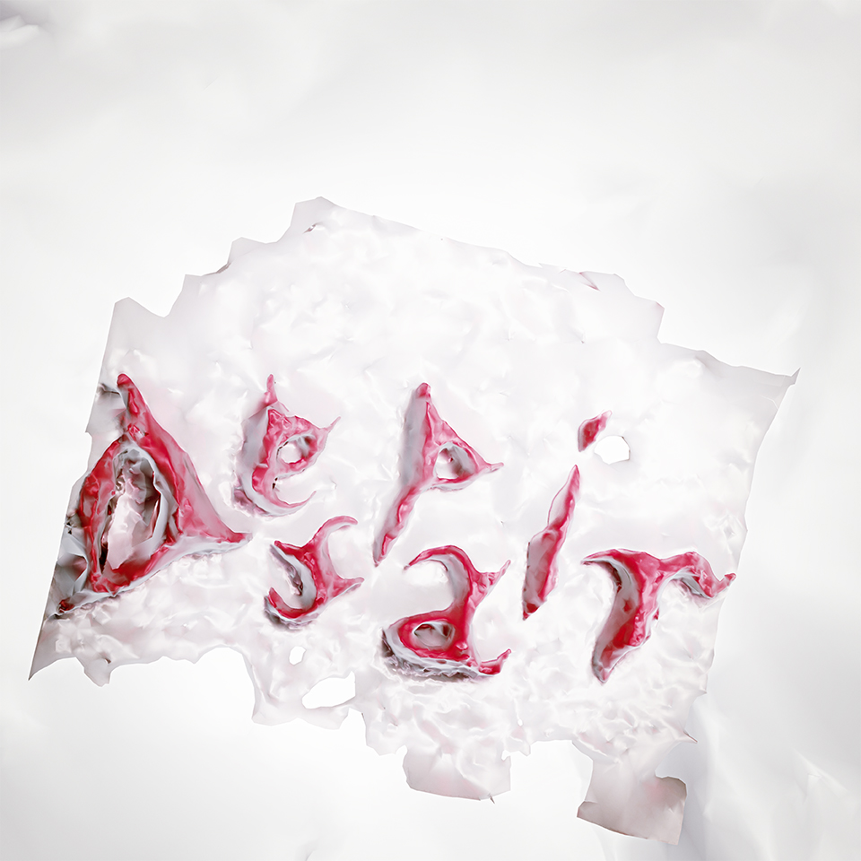
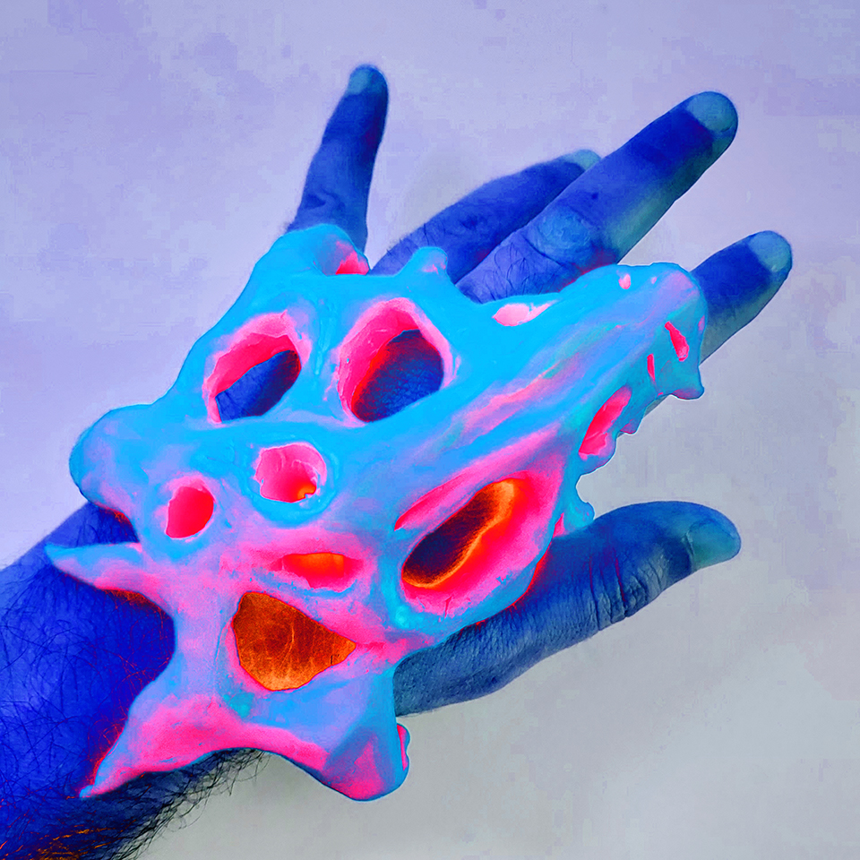
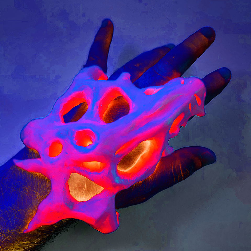
⚫ "Despair" — Second instalment of this series of experimental 3D lettering pieces. In this case, the letters were first modelled by hand and then 3D scanned with a mobile phone, before being torn in Blender. Even if the state of the world pushes us to despair right now, it's worth considering what we can actually do about it so we act on things that we can actually change. Tools used: modelling clay, RealityScan, Blender, Photoshop (April 2025).
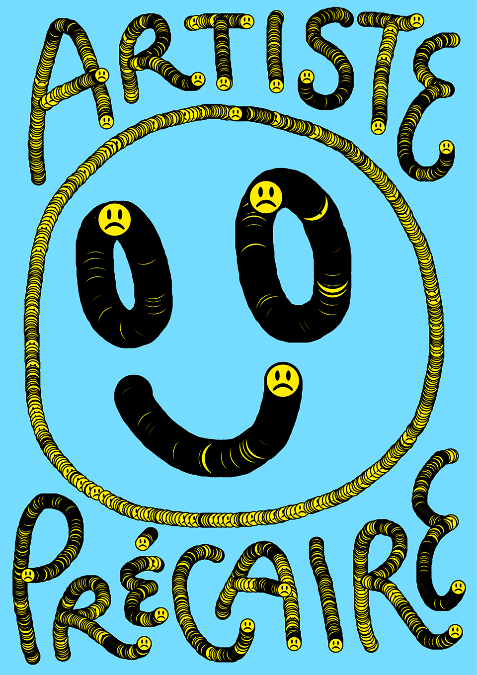
⚫ "Artiste précaire" — A poster drawn in Processing as a submission for a call for artworks issued by Formes des luttes, a French collective fighting against social inequalities in France and in the world. The call, published in March 2025, has the objective to protest against austerity measures in the field of culture conducted by Macron's government, which led to the closure of several cultural centers. You can download the poster for free on the Formes des luttes website. You can also try to reproduce this poster or draw something similar (March 2025).
⚫ "The dusty room" — Short story (February 2025).
⚫ "Genuary 2025" — A series of generative (and occasionally interactive) experiments done in response to the Genuary proposal to code beautiful artworks during the month of January.
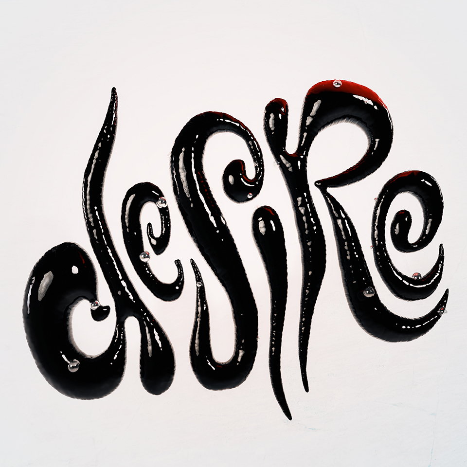
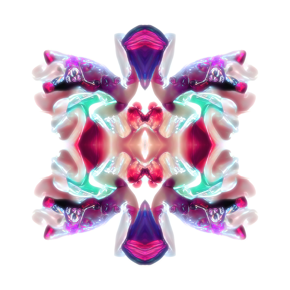
⚫ "Desire" — For this creative collaboration, I teamed up with 3D typography expert Vincent Wagner (Type Computer). Our project was to work with the word "desire". I reinterpreted Vincent's sketch and then rendered it on Blender using a shiny 3D latex material with water droplets, set against a subtly textured background. The overall design plays with early 1990s aesthetics. You can see the other part of the collaboration on Vincent's Instagram account (January 2025).
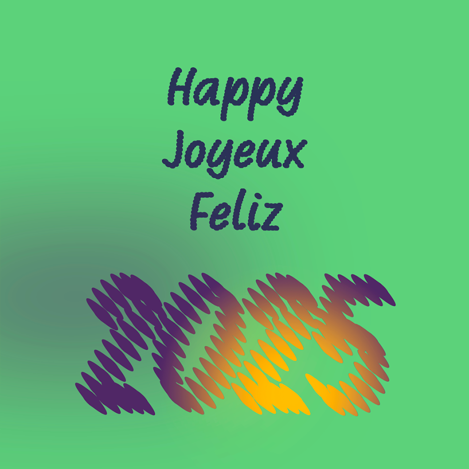
⚫ "Happy 2025" — Every new year is also an opportunity to try novel things. This image recapituates some web design techniques I've been learning lately (variable fonts on the web, javascript interactions). To see it animated, I recommend you look at this link on a computer (it looks a hundred times better than on mobile, seriously).
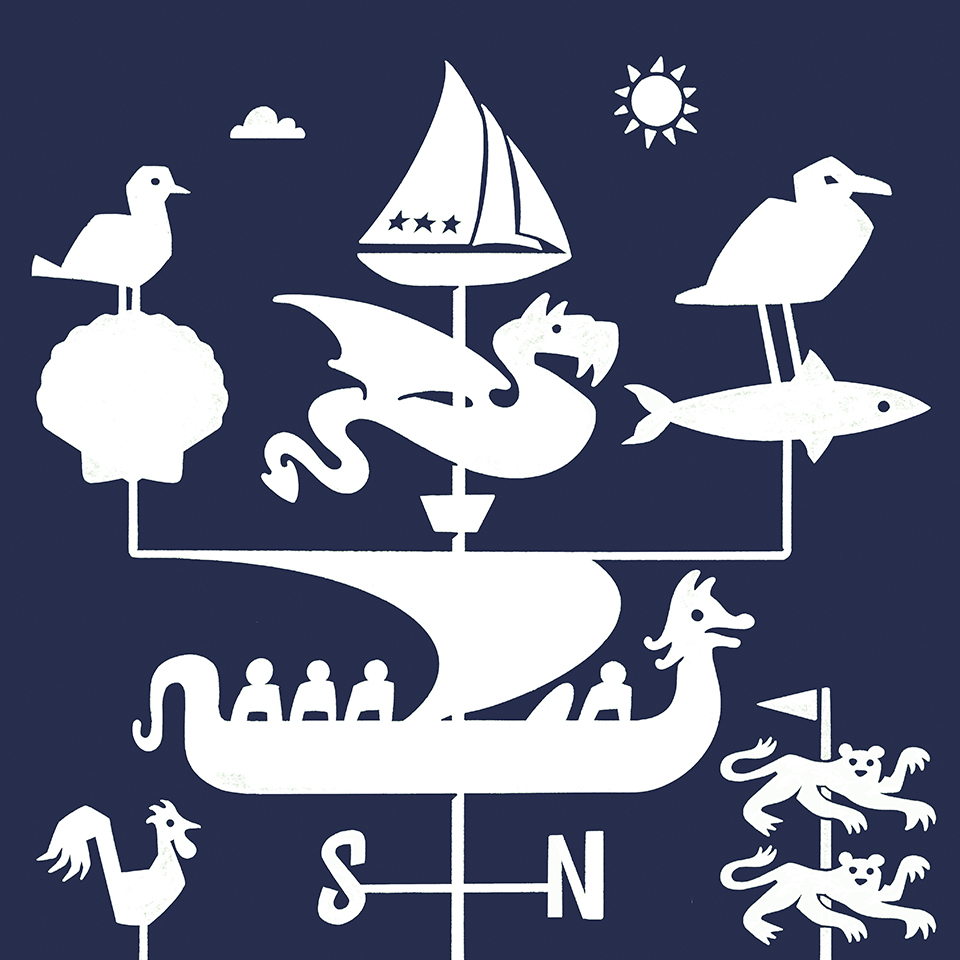
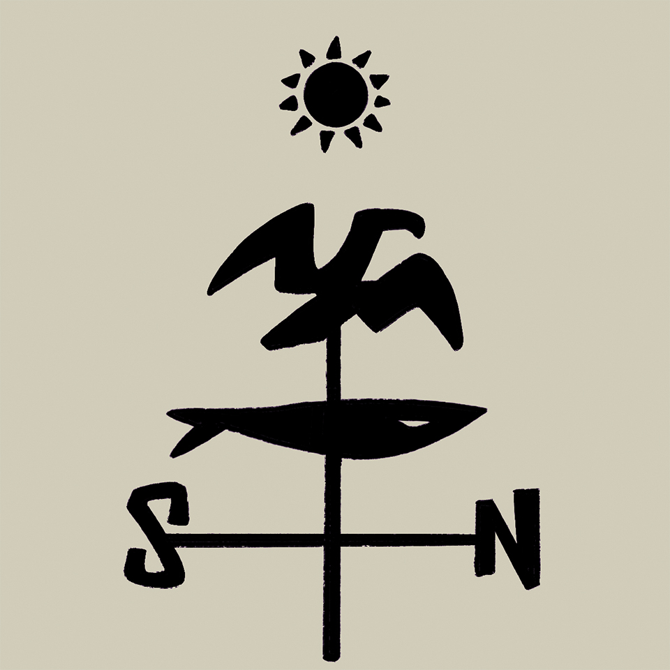
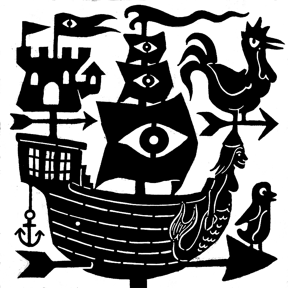
⚫ "Trouville weather vane" — The first picture represents the main symbols of the coastal town of Trouville gathered around a weather vane. In its center, the Trouville barge with its three masts and stars is the symbol of the town and links it to Paris (of which the emblem is a river trading boat). Beneath it, one can find the dragon that until winter 2024 culminated the city hall on a weather vane. The side branches reflect the two fishing seasons in the area, mackerel from May to September (accompanied by the seagull, which is more active during the summer) and scallops from October to April (with the black-headed gull, which usually arrives in winter). The central Viking-Norman ship is reminiscent of the weather vane that crowns the fish market, revisited in my personal style. The rooster recalls those on the city's churches, while the leopards are present on the coat of arms of Normandy.
The second picture recreates the symbols of the mackerel and the seagull in a more stylised manner (December 2024).
⚫ "La chica de la curva" — Horror short movie. Every year, the "girl of the bend" comes back from the afterlife to torture mortals. But this time, things aren't going to happen as usual. Recorded and edited in just 72 hours for the REC72H contest, which is part of the Teror Film Fest (Gran Canaria, October 2024).
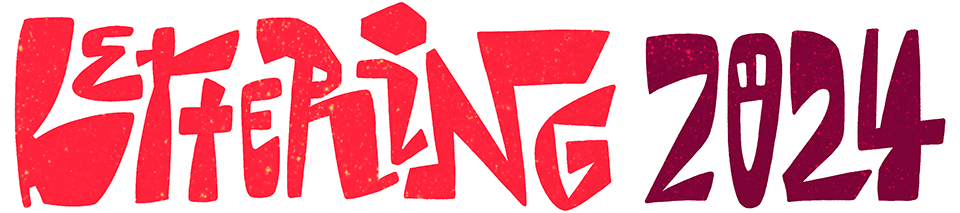
⚫ "Lettering 2024" — A series of lettering pieces done through that year, mainly by using Procreate.
⚫ "Burnout emoji" — A pixel emoji I drew, just before I knew that the Unicode Consortium was going to add an emoji with dark rings under its eyes to its collection. What a coincidence! (August 2024).
⚫ "Evil castle" — So, one of my main obsessions during the summer of 2024 was 1bit & 2bit pixel art, which simply means using a limited colour palette for pixel art (2 colours for 1bit, 4 for 2bit). I find it fascinating how this self-imposed technical limitation creates its own type of retro aesthetic, that's also linked to the ages-old art of embroidery. Anyway, I hope that you'll enjoy this evil castle, its frame was partially inspired by the wooden beam of a house in Trouville (August 2024).
⚫ "ASCII Art 2024" — Textmode pieces composed with my own Sligoil typeface, which you can get for free over at Velvetyne. I took textmode art back in January 2024, after an almost 16-year hiatus (I mostly stopped doing it just after arriving to France, but I did a little in 2022).
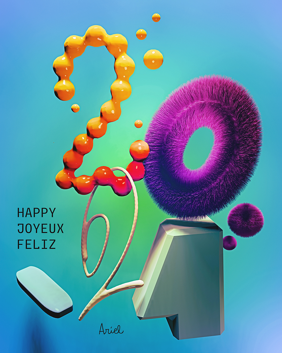
⚫ "Vœux 2024" — This annual greeting card is a good occasion to showcase some of the skills acquired during the year. In this case, the card was designed with Blender, playing with different techniques (metaball, liquid shapes, extrusion, hair particles) and complex lighting settings (January 2024).
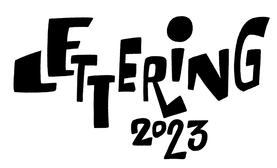
⚫ "Lettering 2023" — A series of lettering pieces done through that year, mainly by using procreate but sometimes using only analog art supplies.
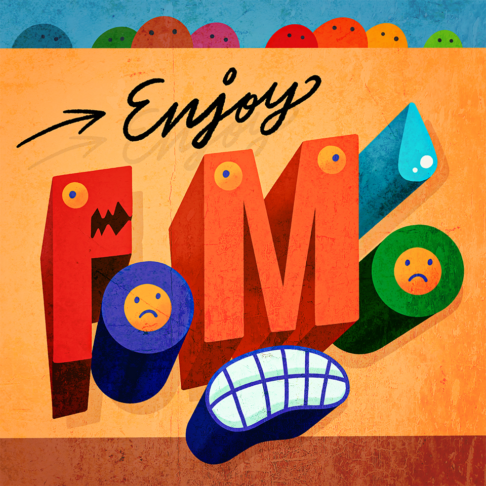
⚫ "Enjoy FOMO" — Driving further into the field of colorful letters with faces, combined with perspective, light and texture effects. The summer of 2023 I sometimes had the feeling that I was missing all the action, but sometimes I have to realise that I can't do everything without extenuating myself or overeating. And that that's OK. So one can always enjoy the FOMO and take a nap or something :) (September 2023).
⚫ "Illustration 2023" — Various illustrations done through 2023, most drawn with the help of Procreate.
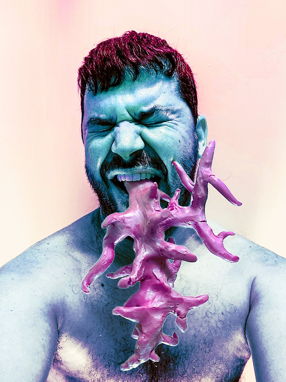
⚫ "Trompa de nemertino" (nemertea proboscis) — Nemertea or ribbon worms is a phylum of animals of which some species are capable to evert a proboscis in order to capture their prey with venom.
This research project imagines what would happen if human beings had a similar organ. Photography (June 2023).
⚫ "Abandoned Dreams" — Street photography, Gran Tarajal, Fuerteventura (January 2023).
⚫ "Mojo de ortigas" — Recipe, in Spanish, Gran Canaria (January 2023).
⚫ "Vœux 2023" — This annual greeting card is a good occasion to showcase some of the skills acquired during the year. In this case, it's a combination of lettering done in PikoPixel which was treated by a Reaction-Diffusion algorithm and then modified with multiple FilterForge filters (January 2023).
⚫ "Ai deligths" — A selection of algorithm-generated art from 2021 to 2022.
⚫ "ASCII Logos 2022" — A couple of textmode logotypes for Applied Metaprojects (my art and type direction studio) and Tunera (my open-source type foundry) (September - October 2022).
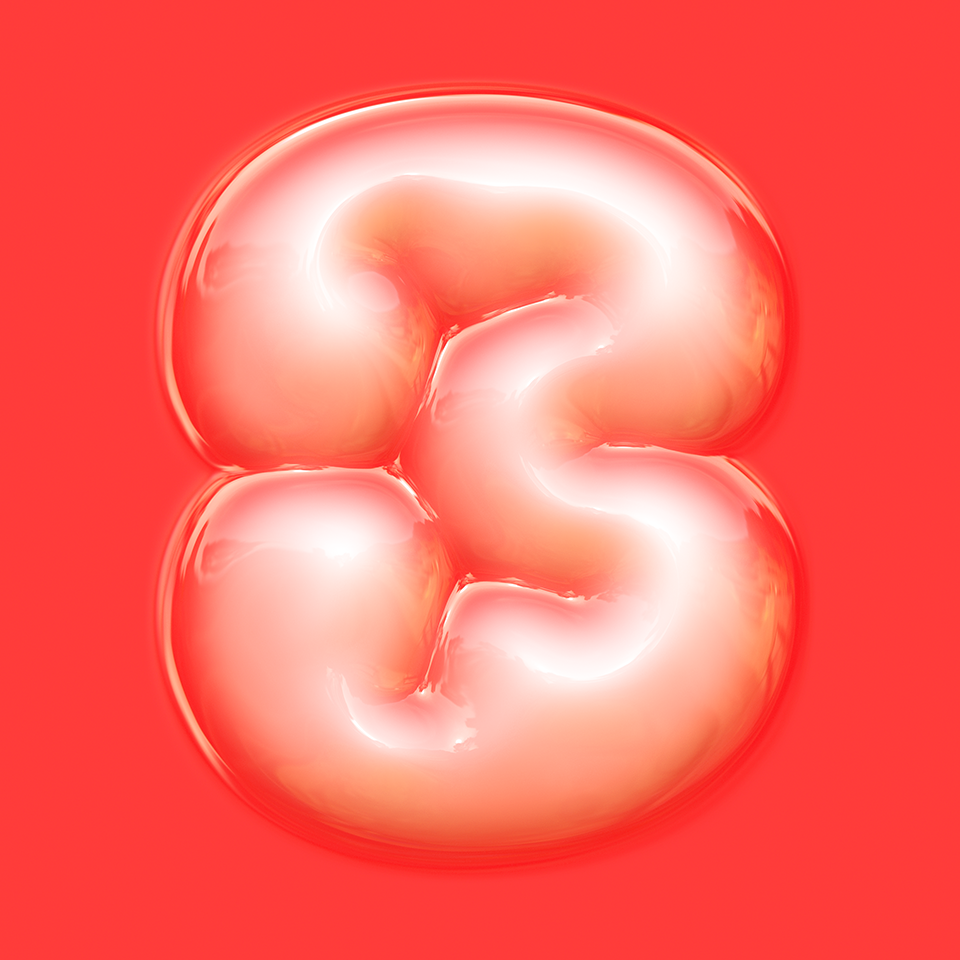
⚫ "Kidney 3" — plastic-wrapped version of the number 3 of my Lobular typeface, that you can get for free here (April 2022).
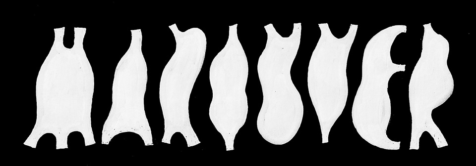
⚫ "Manouver" — Hand-made experimental lettering, pod-like letters (April 2022).
⚫ "Obstinato" — Short story (in French) (March 2022).
⚫ "Double" — Photograph & photo manipulation (February 2022).
⚫ "La Tour" — Short story (in French) (August 2021).
⚫ "L'appel du vide" — photography - somewhere in Normandy (July 2021).
⚫ "Mutating" — Photograph series with modelling clay (July 2021).
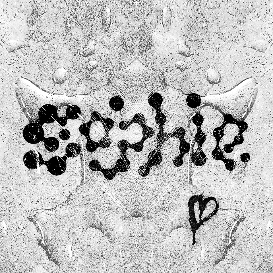
⚫ "Sophie" - lettering piece in homage to Sophie Xeon aka SOPHIE (July 2021).
⚫ "No no normo" — Results of the workshop conducted by Bye Bye Binary at the Maison Populaire de Montreuil. Laser-cut translucent plexiglass and machine-cut adhesive vynil (July 2021).
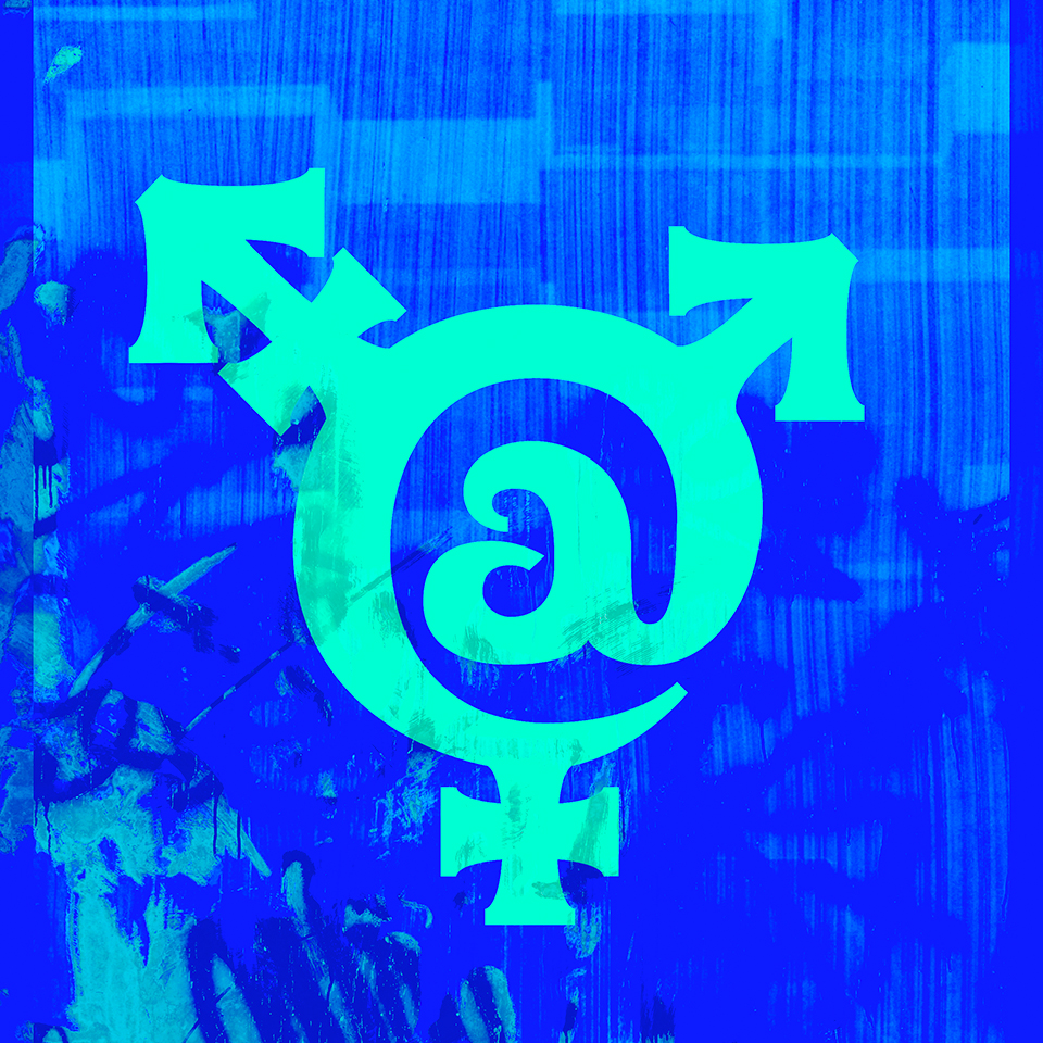
⚫ "Ouroboros - queer" (sample) — Nonbinary typographic symbol (for the Spanish language) created by artist H·Alix Sanyas and incorporated into the Ouroboros typeface by Ariel Martín Pérez (February 2021).
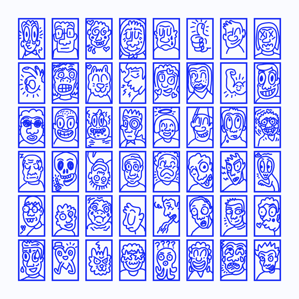
⚫ "Arrumojis" — A series of emoji stickers for Telegram, all finger-drawn in a smartphone with the Simple Draw application (November 2020).
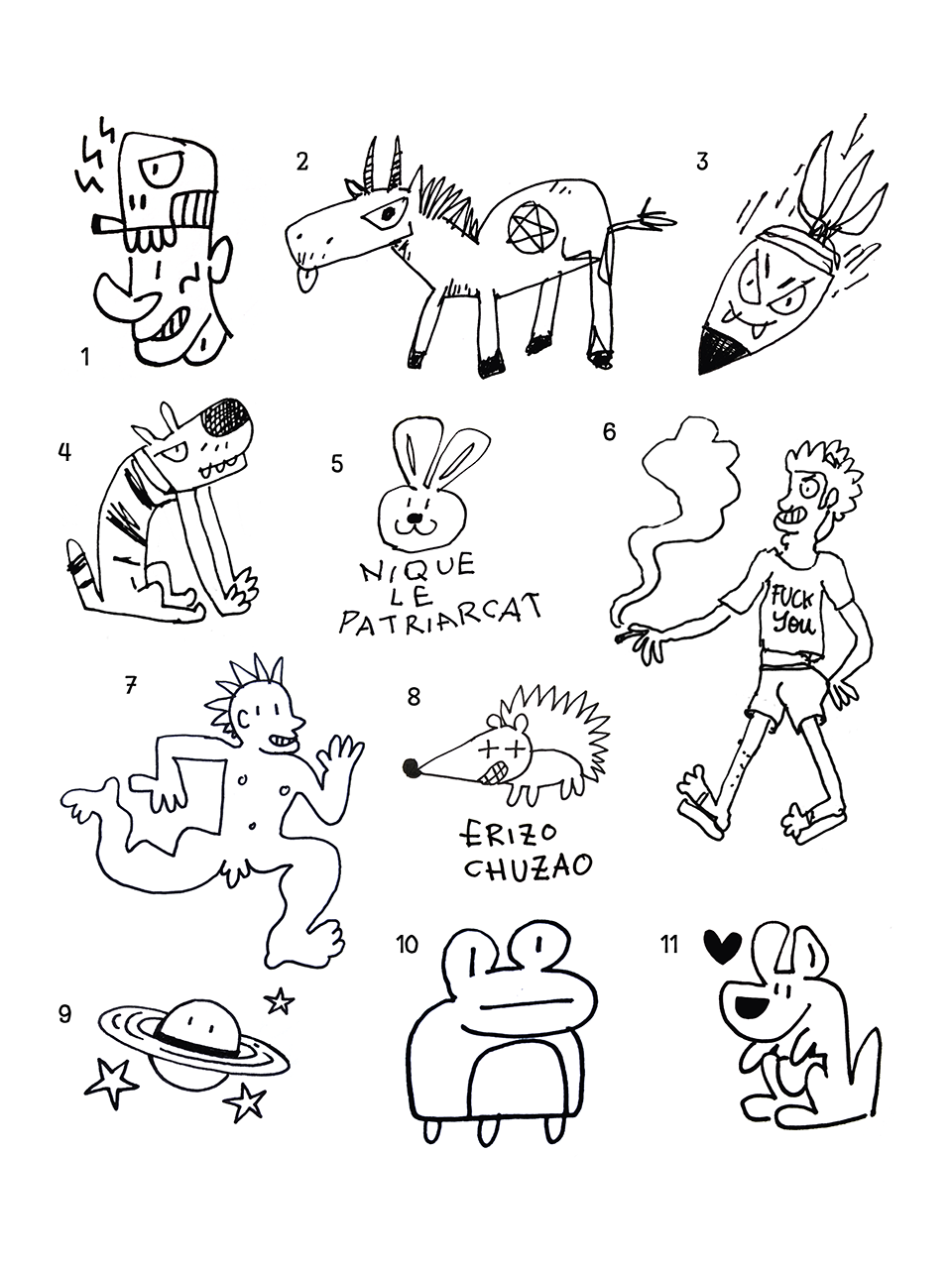
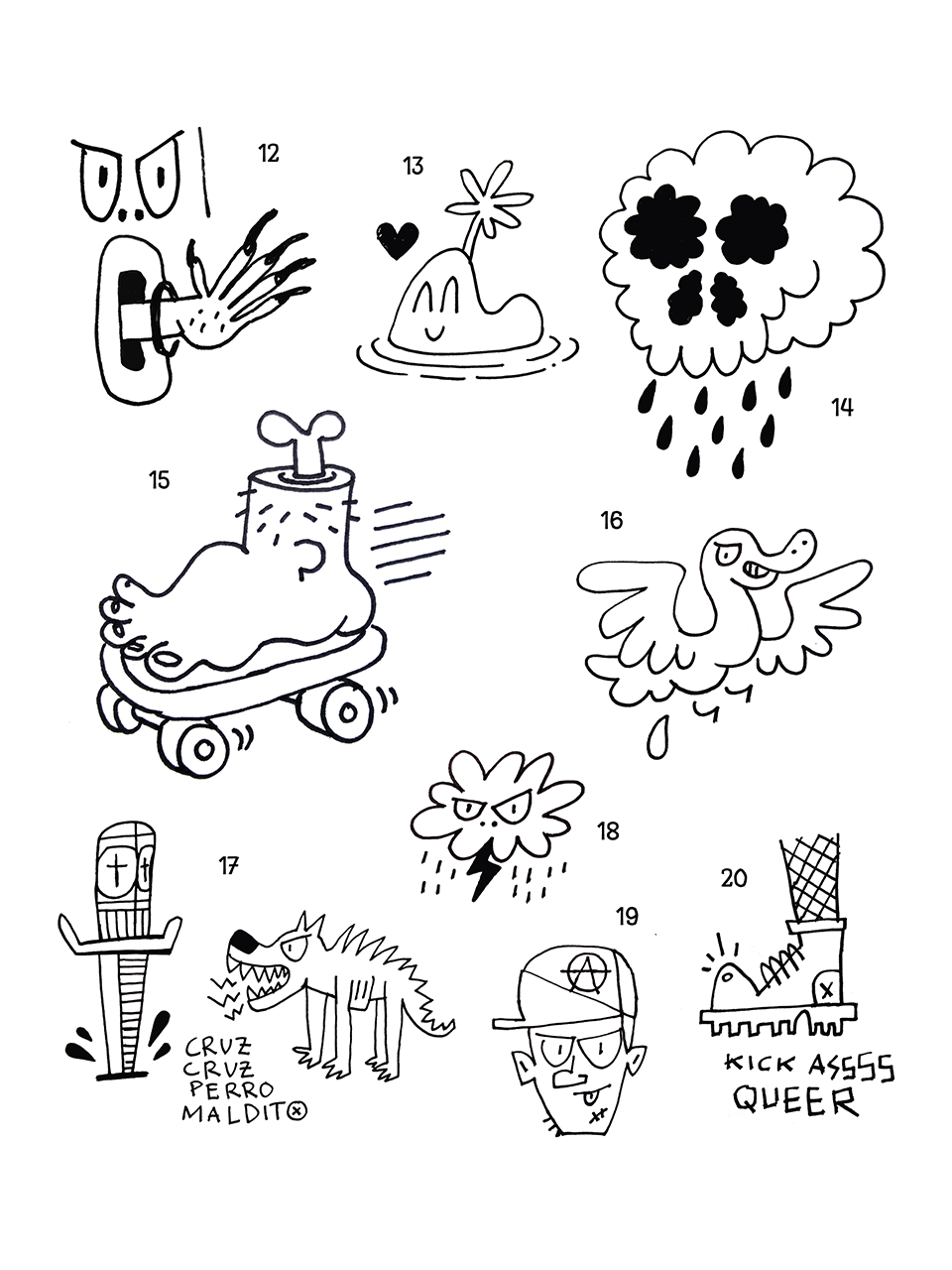
⚫ A collection of flash tattoos that never were, imagined with LGBTerreur (September 2020) - 1) skull cap 2) canasson diabolique 3) vegan bomb 4) chien méchant très méchant 5) lapinique le patriarcat 6) fuck you i’m smoking 7) nudipunki 8) erizo chuzao 9) saturne timide 10) rana rara 11) canguro amor del duro 12) uñas de gel en tu pared 13) la isla del amor bottom 14) kumori memento mori 15) skater pied 16) pájaro cagón cagón 17) cruz, cruz, perro maldito 18) angry cloud / rain on you 19) anarquía y amor de un día 20) kick asssss queer.
⚫ "SNCF serif logotype" — Based on a false memory by Jimmypremier, this exploration imagines an alternate reality in which the SNCF (France's national trainline company) had a serif monogram (August 2020).
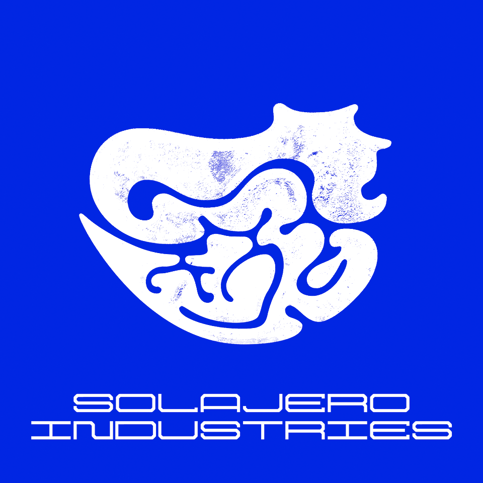
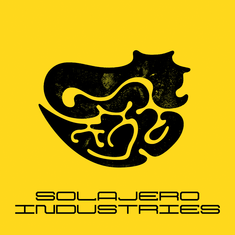
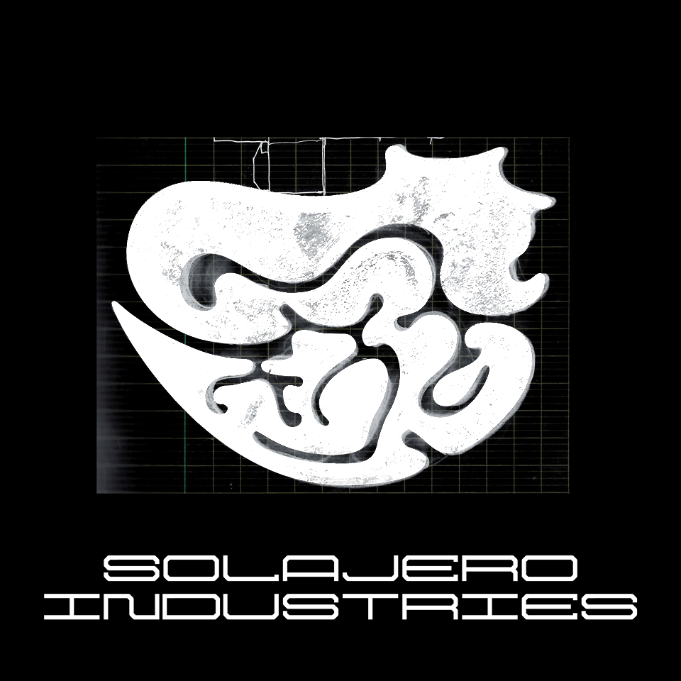
⚫ "Solajero industries" — Imaginary clothing brand logotype based on a letter for a collaborative (ECCO Discord server) font (July 2020).
⚫ "Ductux" (pdf file) — Ductux is an explorative method for cursive hand-writing of gender-inclusive letter forms.
This document was created for a virtual exhibition called "On aime pas ça parce qu’on devient deux*2", which was organised at the request of Roxanne Maillet of the Bye Bye Binary* collective (in French) (June 2020).
⚫ "The year of the pangolin" — 2020 was the Year of the Pangolin. Not only because the covid-19 pandemic was first believed to come from the consumption of the meat of one of these endangered animals, but because biodiversity is one of the greatest ressources we have to fight against the diseases of the future. Cutting forests release deadly viruses, but the forest's species also contains the antibiotics of tomorrow. To protect nature is to protect the human species (March 2020).
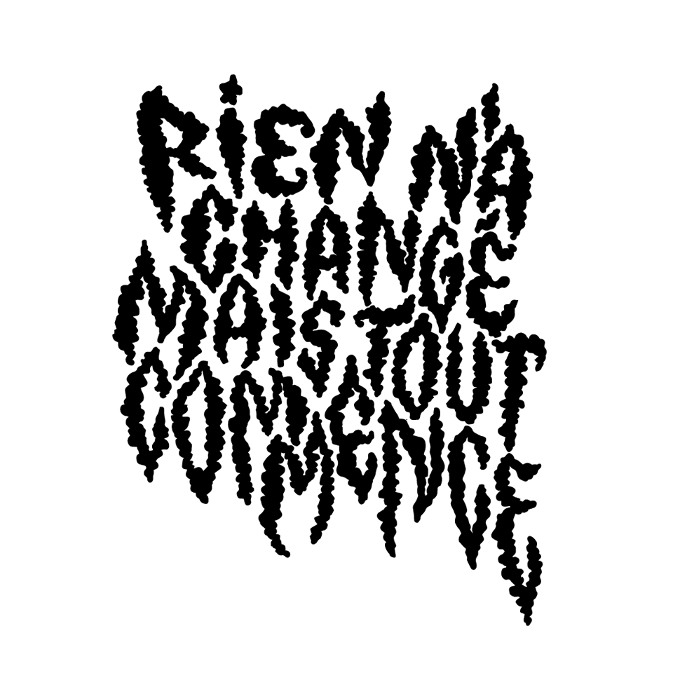
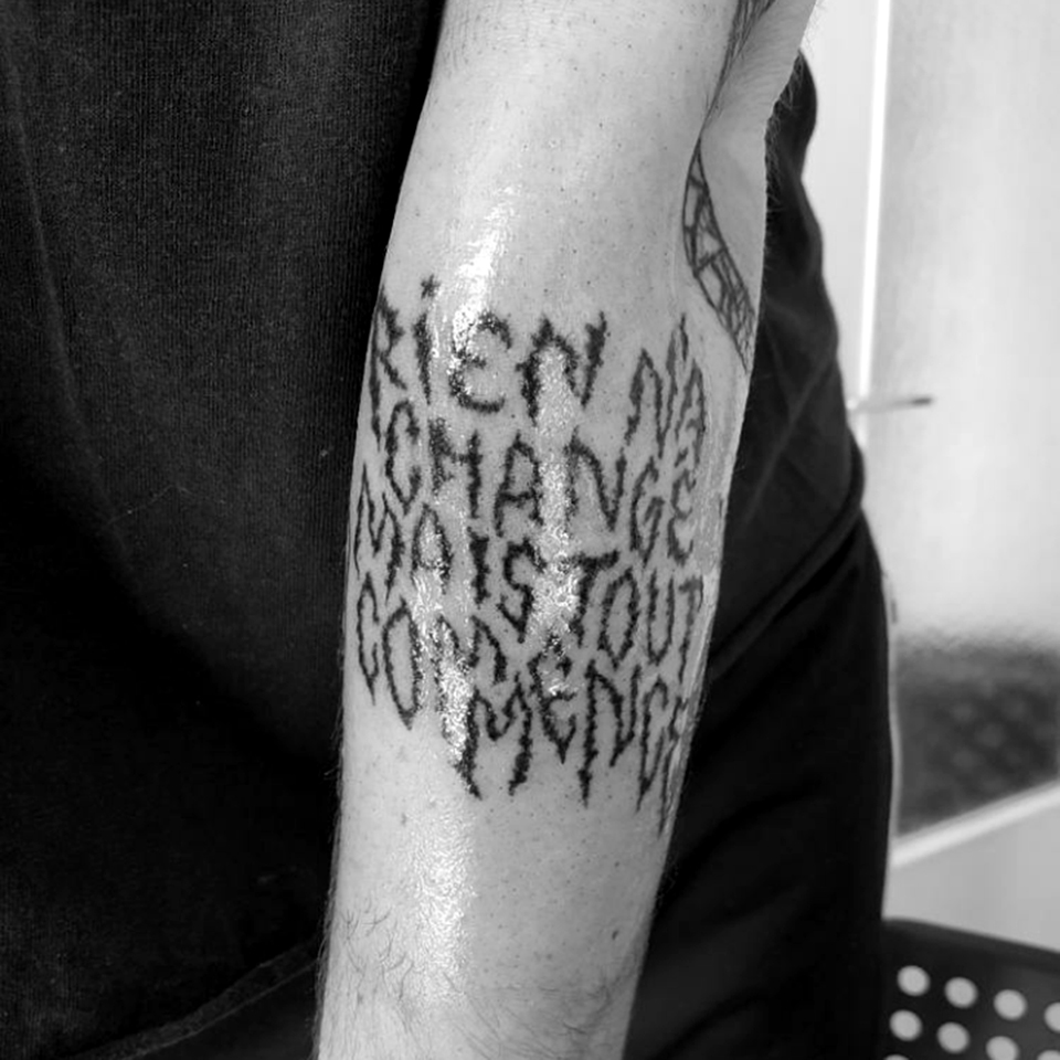
⚫ "Rien n'a changé mais tout commence" — Tattoo, photograph, model by Alix. Based on lyrics by Raoul Vaneigem. Lettering by Ariel Martín Pérez (February 2020).
⚫ "Ouate de phoque" — Icon and lettering design (February 2020).
⚫ "Vœux 2020" — 2020 started very naively as a very promising year, before going into a pandemic. When I made this greeting card for the year, I was still hopeful (January 2020).