ASCII Art Tutorial
Table of contents
- Introduction
- Encoding and character sets
- Font choice
- Art styles
- Picking character shapes
- Antialiasing
- ASCII Art tutorial workflow
- Signature
- ASCII art tools
- Displaying ASCII art online
- Html character entities
- Web accessibility
- Displaying ASCII art on print media
- Conclusion
- Selected articles about ASCII art
- Selected ASCII artists directory
- More ASCII art tools
- Collective projects and experimental tools
Introduction
ASCII art is a form of art that uses letters and symbols as drawing shapes, so the brain, when receiving the optic signal, can interpret them not as strings of characters, but as tabular 2D pictures, in which all of the signs form a whole. This way, letters and symbols are chosen for their individual shapes and for their aesthetic qualities, rather than by their meaning in the context of a text.
       ............
    aaaAAAAHHHHHHHHa..
   8aaAAAAAHHHHAAAhhha
  888aaAAaaAAAAAAAHHHa
  8888aaa"   "AA"   "a
  8888aaa  A  HH  A  a
  888888aa. .AMMA. .AH
   888888AAAAHMMHAAAG"
    88888aaahhhhhhaa"
     8888aaa.   .aa"
      88888ahhhhhh"
        """"""""""
If you didn't read the above paragraph first as a series of disconnected vowels and consonants (a scream reaching for the center of the Earth), but as the illustration of a face, you're able to see ASCII art.
There are several kinds of computer-based art that use letters as building blocks to create images (like ANSI and PETSCII, for a full guide you can read this article by Polyducks). These techniques, including ASCII art, are collectively referred to as "textmode art".
There are also developers and code artists that use filters and dynamic shaders in order to automatically turn photos and videos into ASCII renditions. However interesting those techniques may be, this tutorial is particularly focused on the practice of typing drawings by carefully selecting each character that's going to be part of the full picture.
ASCII art is an incredibly affordable form of art (to anyone with access to a computer). Just open a text editor on the computer, set the font to a monospaced typeface, type characters to draw shapes and you're done. End of the tutorial.
But wait! There's more.
(If you already know the basics of ASCII, you can jump to the tutorial directly ↓)
Encoding and character sets
Strictly speaking, ASCII art only used the letters and symbols contained in the following list:
" # $ % & ' ( ) * + , - . / 0 1 2 3 4 5 6 7 8 9 : ; < = > ? @ A B C D E F G H I J K L M N O P Q R S T U V W X Y Z [ \ ] ^ _ a b c d e f g h i j k l m n o p q r s t u v w x y z { | } ~
"ASCII" stands for American Standard Code for Information Interchange, which was a communication standard used in early computers to make sure that each letter and symbol was encoded (written) as a single set of code points, so a computer could send a text to a printer which would accurately reproduce it, for instance. The original ASCII standard was comprised of 95 printable characters (shown above) and 33 control characters (128 characters in total, which is the maximum number that could be stored in 7 bits).
As you might have noticed, this deprecated set of characters works only for the English language, and it does so in a very limited way. However, most modern computers, smartphones and other devices support a wide array of languages, which means that you can create ASCII art with any character that you can type with your keyboard, or copy from a website as text. The character encoding standard which is most widely used nowadays is called UTF-8 and it can represent over a million characters. Its official character list (managed by the Unicode Consortium) is being expanded regularly.

The infamous "shrug" kaomoji, author unknown, uses the Japanese hiragana symbol "shi" to represent the face of a character. As I'm learning Japanese, I always imagine this symbol the face of a guy called "Shinobi" so I can remember its name.
Personally, when creating ASCII art I prefer to limit myself to the original ASCII set of characters, which means that I have to be creative in order to be able to create diverse images from them, sparking novel ways of reusing the same characters (see the "Picking character shapes" of this tutorial for more information).
Font choice
ASCII art typically uses characters aligned on a square grid, that's why we generally use monospace fonts for it. An heritage from the bygone era of mechanical typewriters' domination, the defining feature of monospace fonts is that each character occupies exactly the same width, which allows to create a consistent vertical alignment of the letters between all the lines of a text.
One safe font choice for this kind of art is Courier New. It's present on most computer systems, which means that ASCII pictures will look the same no matter the device that's used to display it.

Courier New, not the most contrasted monospace font by any means but readily available on most computers.
If you're feeling creative, you can use any other monospace font to draw. The only thing that you only have to take into account is that certain characters might look quite different between fonts, so if you change the font of your drawing, it might look weird. You can check out monospace fonts (also know as "programming fonts") on this link, some of which are free:
Programming fonts website (some of them are free and open-source)
Personally, I use my own Sligoil font because I think it looks great (I know, I shouldn't be the one to say it) and because it doesn't look entirely different from default monospace system fonts, so I can swap them easily without radically changing the look of my creations. You can get it for free on Velvetyne's website:
Sligoil font (free and open-source)
Another monospace font that I like a lot is Adel Faure's jgs font, which was specifically created for textmode art pieces. Some of its characters, like the slashes and backslashes, reach higher and lower than your usual signs, so you can design patterns that are more consistent. This feature reminds me of the old "Amiga" font that was used to make ASCII art back in the time (and nowadays in the demoscene). You can also get it for free through Velvetyne:
jgs font (free and open-source)
Giant squid illustration using the jgs font.
Art styles
There are many different styles of ASCII art. Some artists, like Joan G Stark and Adel Faure, focus on strokes and lines, not so much on fills, giving their art a sleek look not totally unlike the "ligne claire" aesthetic of French and Belgian comics. Other creators, like littlebitspace, use dense letters in order to create different grey tones, patches and gradations, giving their art a more realistic allure.
                   |    :|
                   |     |
                   |    .|
               ____|    .|
             .' .  ).   ,'
           .' c   '7 ) (
       _.-"       |.'   `.
     .'           "8E   :|
     |          _}""    :|
     |         (   |     |
    .'         )   |    :|
.odCG8o_.---.__8E  |    .|
`Y8MMP""       ""  `-...-'   cgmm


     _                  _
    | '-.            .-' |
    | -. '..\\,.//,.' .- |
    |   \  \\\||///  /   |
   /|    )M\/%%%%/\/(  . |\
  (/\  MM\/%/\||/%\\/MM  /\)
  (//M   \%\\\%%//%//   M\\)
(// M________ /\ ________M \\)
 (// M\ \(',)|  |(',)/ /M \\) \\\\
  (\\ M\.  /,\\//,\  ./M //)
    / MMmm( \\||// )mmMM \  \\
     // MMM\\\||///MMM \\ \\
      \//''\)/||\(/''\\/ \\
      mrf\\( \oo/ )\\\/\
           \'-..-'\/\\
              \\/ \\

.                               ,
:.                             ,;
 :o.                         ,o;
  `:oo.                   ,oo;'
    `oooo.             ,oooo'
      `8888o.       .o8888'
        `8888b     d8888'
         `Y888b   d888P'
          `Y888b.d888P'
            8'  "  `8
            '       `
            .       ,
            )b     d(
            `'     `'
     -hrr-
              dbodb
              `Y8P'
              .   ,
              `b.d'
               Y8P
                V
ASCII animals by Christian Garbs, H P Barmario (Morfina) and Horroroso, showing three completely different ways of understanding shading and contour lines, found on the ASCII art archive.
There's also the possibility of combining different approaches and techniques, using lines for the borders and sometimes filling some of the shapes with different kinds of symbols. Finally, the artist known as mouse <3S composes tiny pieces where a few signs, carefully chosen, can give you the idea of an animal. Which brings us to the the next point.
Picking character shapes
Artificial intelligence services such as ChatGPT are notoriously bad at drawing ASCII art (as per June 2026). The reason behind this incapacity is that complex algorithms are very good at detecting patterns and simulating cognitive processes, but, lacking the ability of inferring meaning, they're actually incapable of knowing what they're doing or what they're looking at (like an ASCII picture, which can sometimes feature a high degree of abstraction). Ultimately, I think that given enough examples an LLM could generate complex ASCII art, but it won't mean that it knows what it's generating or why certain characters will produce a certain stylistic effect.
Back to our subject, one of my favourite parts of doing ASCII art is selecting characters for creating a certain visual effect. Underscores, parentheses, slashes and backslashes can be used to draw lines and contours. Dense characters like the 6, the 8 or the 9 can be used to create darker tones, while points and quotes can be employed sparingly to draw thin likes or ghostlike landscapes.
                          ..
                 .       .jj.
       W         v      .jjjj.
     w          (6)   ..jjjjjj.     nn
              .((v)) .:jjjjjjjj:.  nmmn
             .((v6v)).jjjjjjjjjj.:nmmmmn
           .((v6v6v6v)).jjjjjkkk:nmmmmmmn
       a  .((v6v6v6v6v6)).jjkkk:nmmmmmmmmn
       m  .((6v6v6v6v6v)):jkkkk:mmmmmmmmmm
       p   .(v6v6v6v6v6).:kkkkkknmmmmmmmmn
            .((6v6v6v)).:;kkkkkkknmmmmmmn
             .((v6v)).:;;;kkkkkk  nmmmmn
      yYy      ((H))  ":::;;kkk    nmmn
     yYyYy      "H"      ij "|"     on
    YyYyYyY      H       ij  |      on
    yYyYyYy..n...H.......ij..|......on....
    ................n.....................
    ......n...............................
    ::::::::::::::::::::::::::::::::::;;;;
    ::::::::::::;;;;;;;;;;;;;::::::;;;;;;;


           f f
      . __(OyO)__ .
       *:;;888;;:*
           ;;;              ...
            *        .     .....
                     .      ...
                    .,.
                  .:;?;:.
                 .:::::::.
             . .::;;;;;;;::. .
              *::;;;;;;;;;::*       a
                ::;;;;;;;::         m
            . .:::::;;;:::::. .     p
             *::::;;;;;;;::::*
               ::;;;;;;;;;::
           . .::;;;;;;;;;;;::. .
            *::::;;;;;;;;;::::*
              ::;;;;;;;;;;;::
            ..::;;;;;;;;;;;::..
           . ... . . . . . ... .
          . .  .. . . . . ..  . .
          .. ... . . . . . ... ..
          . . ... . . . . ... . .
         ..  ...   . . .   ...  ..
         . ..   ..  . .  ..   .. .
         ..  ..   .  .  .   ..  ..
         ... ... ... . ... ... ...
        .. . . .. . ... . .. . . ..
        . . . . . . . . . . . . . .
       . .   .   .   .   .   .   . .
      .    .   .   .   .   .   .    .
     .   .   .   .   .   .   .   .   .

       .   .   .   .   .   .   .   .


         .   .   .   .   .   .   .


       .       .     .     .       .
"Mathematical trees" (above) and "Castle in the mist" (below), two of my compositions, which show how you can use characters that are more or less dense in order to create different shades and illusions of depth.
Letters like the H and the I can be used to build fences and columns. Ultimately, an O becomes an eye, a "greater than" sign is the beak of a bird and a % is the stray glance of a drunken man, for smaller pieces where every shape counts. In conclusion, the smaller the art piece, the more important the choice of each character will be, whereas for larger pieces one can give free rein to expressive sets of characters that work as textures.
For instance, in this picture I drew (called "The hungry cuckoo") the letter "S" is used to mimic the shape of a worm that a bird holds with its beak (in any other context, it wouldn't be readable as such):
         a
         m
         p            __________
                     ///     | /
               _____/// (o)  \_\
             ///          __/
          __/// .=   _   //    S__
         //// .=     _) //      \o)
        ////  =  _==/ _//       (.\\
       ===/    """   //          \=)\
     ######################      / /""
    =#=#=#=#=#=#=#=#=#=#=#=#====" "====
    #=#=#=#=#=#=#=#=#=#=#=#  __.....___
     #=#=#=#=#=#=#=#=#=#=#::////===///=
              ..////'''''''
          ___////
        ./////
       /////
       ///
      ///
      //
      /
Antialiasing
In pixel art (and more broadly in pixel-based pictures), anti-aliasing is the practice of using intermediate shades of colour in order to ease the transition between two distinct tones and to give a more realistic or even "photographic" (depending on the complexity of the picture) effect.
In ASCII art, we can use some characters in a similar way to create shapes that are slightly better defined and to create other optical illusions and effects. For instance, let's imagine that we want to draw a round shape using ASCII art (it's quite hard to make a perfect circle, because we can't modify the width of characters depending on their height, so we often obtain oblong shapes):
       HHHHHHHHHHHHHHHHHH
    HHHHHHHHHHHHHHHHHHHHHHH
   HHHHHHHHHHHHHHHHHHHHHHHHH
  HHHHHHHHHHHHHHHHHHHHHHHHHHH
 HHHHHHHHHHHHHHHHHHHHHHHHHHHHH
HHHHHHHHHHHHHHHHHHHHHHHHHHHHHHH
HHHHHHHHHHHHHHHHHHHHHHHHHHHHHHH
HHHHHHHHHHHHHHHHHHHHHHHHHHHHHHH
HHHHHHHHHHHHHHHHHHHHHHHHHHHHHHH
 HHHHHHHHHHHHHHHHHHHHHHHHHHHHH
  HHHHHHHHHHHHHHHHHHHHHHHHHHH
   HHHHHHHHHHHHHHHHHHHHHHHHH
    HHHHHHHHHHHHHHHHHHHHHHH
       HHHHHHHHHHHHHHHHH
Not very compelling, isn't it? Don't worry, as with some symbols such as periods, colons and quotes we can easily polish its angles.
         .............
     .:HHHHHHHHHHHHHHHHH:.
   .HHHHHHHHHHHHHHHHHHHHHHH.
  .HHHHHHHHHHHHHHHHHHHHHHHHH.
 .HHHHHHHHHHHHHHHHHHHHHHHHHHH.
 HHHHHHHHHHHHHHHHHHHHHHHHHHHHH
HHHHHHHHHHHHHHHHHHHHHHHHHHHHHHH
HHHHHHHHHHHHHHHHHHHHHHHHHHHHHHH
HHHHHHHHHHHHHHHHHHHHHHHHHHHHHHH
HHHHHHHHHHHHHHHHHHHHHHHHHHHHHHH
 HHHHHHHHHHHHHHHHHHHHHHHHHHHHH
 "HHHHHHHHHHHHHHHHHHHHHHHHHHH"
  "HHHHHHHHHHHHHHHHHHHHHHHHH"
   'HHHHHHHHHHHHHHHHHHHHHHH'
     ':HHHHHHHHHHHHHHHHH:'
         '''''''''''''
We can further reinforce the anti-aliasing effect by changing some of the letters as well, introducing lowercase i's and j's, so they're less dense when they're close to the edge of the object:
         .............
     .:iiiHHHHHHHHHHHiii:.
   .iiHHHHHHHHHHHHHHHHHHHii.
  .iHHHHHHHHHHHHHHHHHHHHHHHi.
 .iHHHHHHHHHHHHHHHHHHHHHHHHHi.
 iHHHHHHHHHHHHHHHHHHHHHHHHHHHi
:HHHHHHHHHHHHHHHHHHHHHHHHHHHHH:
iHHHHHHHHHHHHHHHHHHHHHHHHHHHHHi
iHHHHHHHHHHHHHHHHHHHHHHHHHHHHHi
:HHHHHHHHHHHHHHHHHHHHHHHHHHHHH:
 jHHHHHHHHHHHHHHHHHHHHHHHHHHHj
 "jHHHHHHHHHHHHHHHHHHHHHHHHHj"
  "jHHHHHHHHHHHHHHHHHHHHHHHj"
   'jjHHHHHHHHHHHHHHHHHHHjj'
     ':jjjHHHHHHHHHHHjjj:'
         '''''''''''''
We could refine this technique even further to obtain rounder or softer shapes, or to introducing shading as well as smoothing of the shapes. Below is a piece that I did by combining shading and anti-aliasing:
              .
              %
             %%
             44
             65
             ,66
             6.8
             4,990
             Bn766
             X6h89.
             ....::,%.
              HhjHh.xck
             .fvbhHn.vij
            ,.Ghnmmn.in.
            .okfmmn.jk.
           .shtmnnn.h.
          .cht565n.j..
          ;gHbt67b.jn.
          .cfHtg6bc.j..
           .cfHth7b.hh..
            .dfgth8b.Hh..
            ;vnftfhc.Hhh.
           .;dbmntH.m.hh;      .
          .;cHhmnn.nm.Nh.     .i.
         .:j:;bnmb.jkl.nh.    .h:.
        .:c:;c:;m.;.n.o.o..   .ghh.
       .;dh:.;dbnn.b.n.m:;.   :fgh:;
       ;dnhg.dhnmn.hn.df.;   .:cjgh:;,
      .cvbghghjkl.mno.b:.   .:;ghjkh:;
      .dnmh.fji.nmnomc.:;:.:;cvHbghH:;
     .;dfghijjk..lml.nmn.odbodnmhtgh:
    ..:ctgoboj...dnmm.n.o.monptqrstb.
    .:dHBMNobjk.mnmk.lkl.o.moqpmnop;
    .;nkljnNnmotonm.mk.lp.rmootmnp.
   ..;bhttynMNMntty.n.nnon.rtnmno.
   .:vndbhtynMntyt.dbon.on.gvrty.
   .:cdlhtkbvtkr.tst.o...noklmn:.
   .:;cgtyuiogt.yvnm.ty.rsttyu:..
    .:dfgtyuon..nmnv.uio.stuor::.
    .:vyjklun...dbv.nmop..tsumb:,,
   .:;omndbnio.dfftftuyp:.:fski;,..
  ,;;cdfgtunmrtklmnnostyu;fgsrt:;:,..
 .;;;dfghtnummntrlnmnntsu.klmsrt;::;..
.:;dfgftunummmmtkrmnstuiovlmnnsrtt;:::
:;:fftghhunnmmnkrtmunsuoilmnnltttstt;:
;:cdfgttuhnnnuvutrtnuuoiosrtnnltuios;:
:;cghyttuunmopqnstrruuuoiisttntliuios:
:;dfggtuuttnmomntrssruuioiiottuttiouss
;dghhhtyutunmoomttrsuuioiiioittuttisss
dfgggtyuutyunmonrturssruioursstsussuss
hfggggtyuytnunmnotyusrtyuiustytusuusss
Hthrghtunntynmmnuotiosghyusrunsutnuuss
ASCII Art tutorial workflow
As we've got already some bases covered, let's proceed to make an ASCII art piece on the computer.
1) First, open your text editor of choice and select a monospace font on the font menu (if you don't know which one to pick, just choose "courier new").
You can also use a code editor for drawing ASCII art (in this kind of programs, monospace fonts are the default ones). For instance, Pulsar is free and open-source.
2) Now, let's try to draw an animal, like a cat, using ASCII art. As I prefer using filled-out styles, I'm going to try to draw its silhouette by typing a dense letter, like the letter H, for instance. So let's start by drawing an oval for the head.
     HHHHHHHHH
    HHHHHHHHHHH
   HHHHHHHHHHHHH
   HHHHHHHHHHHHH
    HHHHHHHHHHH
     HHHHHHHHH
3) Nice. Now I could draw another, bigger, oval-like shape to represent the body of the cat. I duplicate the first one and then I type more H's in order to make it grow.
     HHHHHHHHH
    HHHHHHHHHHH
   HHHHHHHHHHHHH
   HHHHHHHHHHHHH
    HHHHHHHHHHH
     HHHHHHHHH
     HHHHHHHHH
    HHHHHHHHHHH
   HHHHHHHHHHHHH
   HHHHHHHHHHHHH
    HHHHHHHHHHH
     HHHHHHHHH
     HHHHHHHHH
    HHHHHHHHHHH
   HHHHHHHHHHHHH
   HHHHHHHHHHHHH
    HHHHHHHHHHH
     HHHHHHHHH
     HHHHHHHHH
    HHHHHHHHHHH
   HHHHHHHHHHHHH
  HHHHHHHHHHHHHHH
 HHHHHHHHHHHHHHHHH
 HHHHHHHHHHHHHHHHH
 HHHHHHHHHHHHHHHHH
  HHHHHHHHHHHHHHH
    HHHHHHHHHHH
     HHHHHHHHH
4) What about adding some defining features, like the ears and the tail?
       H   H
      HHH HHH
     HHHHHHHHH
    HHHHHHHHHHH
   HHHHHHHHHHHHH
   HHHHHHHHHHHHH
    HHHHHHHHHHH
     HHHHHHHHH
     HHHHHHHHH
    HHHHHHHHHHH
   HHHHHHHHHHHHH
  HHHHHHHHHHHHHHH
 HHHHHHHHHHHHHHHHH
 HHHHHHHHHHHHHHHHH
 HHHHHHHHHHHHHHHHH
  HHHHHHHHHHHHHHH
    HHHHHHHHHHH
     HHHHHHHHH
       H   H
      HHH HHH
     HHHHHHHHH
    HHHHHHHHHHH
   HHHHHHHHHHHHH
   HHHHHHHHHHHHH
    HHHHHHHHHHH
     HHHHHHHHH
     HHHHHHHHH
    HHHHHHHHHHH
   HHHHHHHHHHHHH      HHH
  HHHHHHHHHHHHHHH    HHH
 HHHHHHHHHHHHHHHHH  HHH
 HHHHHHHHHHHHHHHHH  HHH
 HHHHHHHHHHHHHHHHH  HHH
  HHHHHHHHHHHHHHH   HHH
    HHHHHHHHHHHHHHHHHH
     HHHHHHHHHHHHHHH
5) I'm going to try to give a bit more character to the cat by drawing its face and fur colours.
       H   H
      HHH HHH
     HH  H  HH
    HH O _ O HH
   HHH  >X<  HHH
   HHHH     HHHH
    HHHHHHHHHHH
     HHHHHHHHH
     HHH   HHH
    HH       HH
   HH         HH      HHH
  HHH         HHH    HHH
 HHHHH       HHHHH  HHH
 HHHHHH     HHHHHH  HHH
 HHHHHHH   HHHHHHH  HHH
  HHHHHHHHHHHHHHH   HHH
    HHHHHHHHHHHHHHHHHH
     HHHHHHHHHHHHHHH
Note: if you want to use the < and > symbols on a website (like for the whiskers of this cat), you might have to replace them by < and > respectively. For more information, please check the html character entities section of this tutorial.
6) Cute! Now, let's try to give the cat drawing's edge more definition by using some of the anti-aliasing techniques that I've previously covered. For that, I'm going to replace some of the H's by other letters. Lowercase letters, with their lower height, and letters like d and b, p and q can be used to give some subtlety to our drawing (here I used them on the tail of the cat).
Other letters can be used because of their shape, like I can use the letter A to make the pointy ears, and the letters A and V to make slanted borders.
       A   A
      AHA AHA
     AV  V  VA
    AV O _ O VA
   AHA  >X<  AHA
   VHHA     AHHV
    VHHHHHHHHHV
     HHHHHHHHH
     HHV   VHH
    AV       VA
   AH         HA      dHD
  AHA         AHA    dHH
 AHHHA       AHHHA  dHH
 HHHHHA     AHHHHH  qHH
 VHHHHHA   AHHHHHV  HHb
  VHHHHHA AHHHHHV  dHHp
    VHHHHVHHHHHHHAdHHp
    AHHHHHHHHHHHHHHHV
8) I could leave the cat's borders as they currently are if I wanted a very geometric look, but I want to introduce some shading and increase the anti-aliasing so I'm going to sprinkle some symbols on it. I generally use " and ' for softening edges from below, and . for softening them from above. I'm also going to add lowercase letters near the borders of the picture in order to create a softer look on certain areas.
       A   A
      dHb.dHb
     AF"'V'"Vb
    AF O _ O Vb
   dfi. >X< .ifb
   qHib.....diHp
    "HiHHHHHiH"
     :::::::::
     dHV"'"VHb
    dV'     'Vb
   dH         Hb      dHD
  dHA         AHb    dHH
 dHHH:       :HHHb  dHH
 nHH:Hb.   .dH:HHn  qHH
 qHH:HHA:.:AHH:HHp  dHb
  "HH:HHA:AHH:HHA. .HHp
   "VH:HHVHH:HHH:AAHHp
   .AHH:HHH:HHH.HHHHV
9) This way I've obtained a cartoon illustration cat. Now, let's try something more ambitious. By recovering our first cat silhouette, I would like to make another, more realistic version, version that's looking sideways. As I'm not that used to drawing this animal, I've employed some photographs I've found online as a reference (on a screen parallel to my text editor, not typing letters directly over them, but I've seen online draw ASCII art by applying a text layer above a photograph).
       H   H
      HHH HHH
     HHHHHHHHH
    HHHHHHHHHHH
   HHHHHHHHHHHHH
   HHHHHHHHHHHHH
    HHHHHHHHHHH
     HHHHHHHHH
     HHHHHHHHH
    HHHHHHHHHHH
   HHHHHHHHHHHHH      HHH
  HHHHHHHHHHHHHHH    HHH
 HHHHHHHHHHHHHHHHH  HHH
 HHHHHHHHHHHHHHHHH  HHH
 HHHHHHHHHHHHHHHHH  HHH
  HHHHHHHHHHHHHHH   HHH
    HHHHHHHHHHHHHHHHHH
     HHHHHHHHHHHHHHH
        H
        HHH
     HHHHHHHH
    HHHHHHHHHHH
  HHHHHHHHHHHHH
  HHHHHHHHHHHHH
   HHHHHHHHHHHHH
      HHHHHHHHHH
      HHHHHHHHHH
     HHHHHHHHHHHH             HHH
     HHHHHHHHHHHHHHHH        HHH
     HHHHHHHHHHHHHHHHHH     HHH
      HHHHHHHHHHHHHHHHHH    HHH
      HHHHHHHHHHHHHHHHHH    HHH
      HHHHHHHHHHHHHHHHHHH   HHH
      HHHHHHHHHHHHHHHHHHH    HHH
      HHHHHHHHHHHHHHHHHHH     HHH
      HHHHHHHHHHHHHHHHHHH     HHH
      HHHHHHHHHHHHHHHHHHH     HHH
     HHHHHHHHHHHHHHHHHHHHH   HHHH
   HHHHHHHHHHHHHHHHHHHHHHHHHHHHH
   HHH  HHHHHHHHHHHHHHHHHHHHHHH
10) Now, I'm going to add some morphological features to make the illustration feel more life-like, by changing some of the letters to others that are more dense (like the letter B) or more sparse (like the letter f).In ASCII art, I usually represent human eyes like this:
        b
        HHb
     dHHHHHHb
    dHHfffHHHHb
  WHHH.O)fHHHHH
  qHHHHffffHHHH
   CHHHHHffHHHHb
      HHHHHHHHHH
      HHHHHHHHHH
     HHHHHHHHBBHH             dHb
     HHHHHHHHHHHHHHHb        dHV
     qHHHHHHBHHHHHHHHHb     dHH
      HHHHHBBBHHHHHHHHHb    HHH
      HHHHBBBBBBHHHHHHHH    HHH
      HHHHBBBBHHHHHHHHHHb   qHH
      HHHBBBHHHHHHHHHHHHH    HHH
      HHHBBHHHHHHHHHHHHHB     HHb
      HHHBBHHHHHHHHHHHHBB     HHH
      HHHBBBHHHHHHHHHHBBB     HHH
     dHHBBBBBHHHHHHHBBBBBb   HHHp
   dHHHBHHHHHHHHHHBBBBBHHHHHHHHp
   VHH   HHHHHHBBBBBBBHHHHHHHHp
        b.
       .HHb.
     dHHHHHHb.
    dHHfffHHHHb
  WHHH.O)fHHHHH
  qHHHHffffHHHH.
   CHHHHHffHHHHb
      )HHHHHHHHH
     .HHHHHHHHHH.
     HHHHHHHHBBHH:.          .dHb
     HHHHHHHHHHHHHHHb       .dHV
     qHHHHHHBHHHHHHHHHb.    dHH
      HHHHHBBBHHHHHHHHHb:   HHH
      HHHHBBBBBBHHHHHHHH:   HHH
      HHHHBBBBHHHHHHHHHHb   "HH.
      HHHBBBHHHHHHHHHHHHH    HHH.
      HHHBBHHHHHHHHHHHHHB     HHb
      HHHBBHHHHHHHHHHHHBB     HHH
     .HHHBBBHHHHHHHHHHBBB     HHH
    .HHHBBBBBHHHHHHHBBBBBb  .HHHp
   dHHHBHHHHHHHHHHBBBBBHHHHHHHHp
   VHH" "HHHHHBBBBBBBHHHHHHHHH"
11) To finish this drawing, I'm going to replace the letter H for the letter F, in order to give the picture some more texture and improve the shading.
        b.
       .FFb.
     dFFFFFFb.
    dFFfffFFFFb
  WFFF.O)BFFFFF
  qFFFFffffFFFF.
   CFFFFFffFFFFb
      )FFFFFFFFF
     .FFFFFFFFFF.
     FFFFFFFFBBFF:.          .dFb
     FFFFFFFFFFFFFFFb       .dFV
     qFFFFFFBFFFFFFFFFb.    dFF
      FFFFFBBBFFFFFFFFFb:   FFF
      FFFFBBBBBBFFFFFFFF:   FFF
      FFFFBBBBFFFFFFFFFFb   "FF.
      FFFBBBFFFFFFFFFFFFF    FFF.
      FFFBBFFFFFFFFFFFFFB     FFb
      FFFBBFFFFFFFFFFFFBB     FFF
     .FFFBBBFFFFFFFFFFBBB     FFF
    .FFFBBBBBFFFFFFFBBBBBb  .FFFp
   dFFFBFFFFFFFFFFBBBBBFFFFFFFFp
   VFF" "FFFFFBBBBBBBFFFFFFFFF"
And then give it some highlights with lowercase f letters, zones that would be hit by the light, and some more darker zones with B letters and hashtags.
        b.
       .FBb.
     dFFffBBb.
    dF//fffBBBb
  WFF/.O)BF/BBF
  qFFffffffFBBF.
   CFFFFFffBBBFb
      )FFFFBBFFF
     .FFffFFFFFF.
     FFffffFFBBFF:.          .//b
     FFFffFFFFFFFFFFb       ./FV
     qFFFFFFBFFFF/FFFFb.    dFF
      FFFFFBBBFFFFffFFFb:   FFF
      FFFFBB#BBBFFfffFFF:   FFF
      FFFFB#BBFFFffffFFFb   "FF.
      FFFB#BFFFffffffFFFF    FFF.
      FFFBBFFFfffffffFFFB     FFb
      FFFBBFFFffffffFFFBB     FFF
     .FFFBBBFFFffffFFFBBB     FFF
    .FFFBBBBBFFFFFFFBBBBBb  .FFFp
   dFFFBFFFFFFFFFFBBBBBFFFFFFFBp
   VFF" "FFFFFBBBBBBB##FFFFGBB"
12) I think this cat illustration is done. I'd also like to try to draw a version of the same cat that would be made of lines instead of a solid style. For that, I'm going copy my solid-style drawing and then I'm going to manually trace the outer border of the cat by using slashes and backslashes for the diagonal lines, as well as hyphens and undescores for the horizontal ones. For underscores, I have to draw the contour from the outside, often placing the symbol just above the line that I want to draw.
When drawing ASCII pieces with a line style, it's very important to consider the way that the elements articulate with each other, like in the angles of the branches of a tree or in the natural folds of the body like the armpits, the neck or the groin.
        |:.
      __L  :.
     /       :.
   _/         ).
  T:  .O)      :
  (            :
   \___        |
      )::::::::|
     .          :.             _
     [           :.          .  )
     L             :._      :  /
     \.               :.    (  |
      {      _. ..     :.   [  ]
      |     /       .   |   :  ]
      |    /            |    \  \
      |   |             |     :  )
      |   |             :     |  :
      |   |             (     |  |
     /   /\             \    /   /
    .   /__\_            \__/   /
   (   /(             :        /
   \__/  \___________/________/
13) And now I can add some subtle shading.
        |:.
      __L  :.
     /       :.
   _/         ).
  T:  .O)      :
  (            :
   \___        |
      )::::::::|
     .::        :.             _
     [:          :.          .  )
     L:            :._      :  /
     \.       :       :.    (  |
      {      _. ..     :.   [  ]
      |:    /       .   |   :  ]
      |:   /            |    \  \
      |:  |:            |     :  )
      |:  |:            :     |  :
      |:  |:            (     |  |
     /.  /\ .           \    /   /
    .   /__\_.           \__/   /
   (   /(:.           :        /
   \__/  \___________/________/
For giving an impression of volume, it's important to add some shades that aren't just placed near the edges or the creases of the drawing to avoid the dreaded "pillow shading" effect, in which our picture looks quite flat save for a slight bevel around the angles.
        |:.
      __L  :.
     /       :.
   _/.        ).
  T:  .O)      :
  (:.          :
   \___        |
      )::::::::|
     .::.       :.             _
     [:....      :.          .  )
     L:...         :._      :  /
     \..      :       :.    (  |
      {:..   _. ..     :.   [  ]
      |:.   /       .   |   :  ]
      |:.  /            |    \  \
      |:  |:            |     :  )
      |:  |:            :     |  :
      |:  |:.           (     |  |
     /.  /\ ..          \    /   /
    :.  /__\_..      .   \__/   /
   (:: /(::......    ":.       /
   \__/  \___________/::._____/
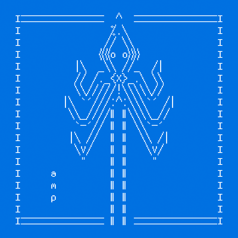
14) To finish this illustration, I'm going to place the two versions of the cats facing each other , in an interior setting, and I'm going to add a decorative frame and a banner. I made the mirror image of the white cat by changing all the symbols of place manually, and I used ASCIIflow to help me with the composition.

English translation: the female cats, like sphinxes, awaited their sustenance, flanking the window with identical attitude.
All done! As this illustration is very wide, I've included it in this page as a svg file, but it's also available in its text form on this link.
Signature
ASCII artists usually have a signature consisting on two or three letters, like an alias, that they use to mark their creations. You may decide on your own signature prior to publishing your art online, based on your initials or on your alias, that you can include in your pieces.
  |
  |
  + \
  \\.G_.*=.
   `(#'/.\|
    .>' (_--.
 _=/d   ,^\
~~ \)-'   '
   / |   a:f
  '  '
This iconic knight and horse was drawn by a:f (Andreas Freise).
   ...    *    .   _  .
*  .  *     .   * (_)   *
  .      |*  ..   *   ..
   .  * \|  *  ___  . . *
*   \/   |/ \/{o,o}     .
  _\_\   |  / /)  )* _/_ *
      \ \| /,--"-"---  ..
_-----`  |(,__,__/__/_ .
       \ ||      ..
        ||| .            *
        |||
ejm98   |||
  , -=-~' .-^- _
Sometimes, ASCII illustrations feature a year or a date, like this cute owl made by llizard (AKA ejm) in 1998.
If you want to modify an ASCII art piece that you've found online, please keep the original signature intact and (whenever possible) link back to the original artist's page and explain what changes have you made. But keeping the original signature intact is better than nothing.
More information about ASCII signatures.
My ASCII signature consists in the letters "amp" of my name stacked in a vertical line. I'm also thinking that, following the symbol of the cat, one could use ASCII stamps that would serve as signatures, with different levels of complexity to mark various emails and documents.
  |\_/| a
  (O.O) m
  /"""\ p

  |\     /|
  | "---" |  a
  |.O _ O.|  m
  \   V   /  p
   """""""
  .________________.
  |              a |
  |   |\  ?!  /| m |
  |   | \____/ | p |
  |   | _ .. _ |   |
  |   |(|)__(|)|   |
  |   \  :\/:  /   |
  |––/ \______/ \––|

  .____________________.
  |                    |
  |        o__o        |
  | .      (..)      a |
  | . |\   /\/\   /| m |
  | . | \_/____\_/ | p |
  |   |  _ .... _  |   |
  |   | (|) __ (|) |   |
  |   \  " :\/: "  /   |
  |   /\    /\    /\   |
  |––/  \________/  \––|
ASCII art tools
The easiest way to do ASCII art is to use a basic text editor (Notepad on Windows, TextEdit on Mac, vim or emacs in linux). Alternatively, you can use a code editor or any system that allows you to type, but from my experience the simpler the editor the easier will be to keep my focus on the art. There are some dedicated tools for drawing ASCII art online, two of my favourites are analyzed below.
When I'm travelling, specially when I'm on the plane (I don't know why) I like to draw ASCII art on my phone. It's kind of like a relaxing meditation, opening a document and not knowing quite what I'm going to draw, letting forms emerge from a string of randomly typed characters. For that, I use Markor, an app for Android phones that's aimed at writing Markdown documents, but that is as easily used to create this kind of pictures (the default font is monospace). Just remember to turn down the syntax highlighting so it doesn't interfere with your drawing.
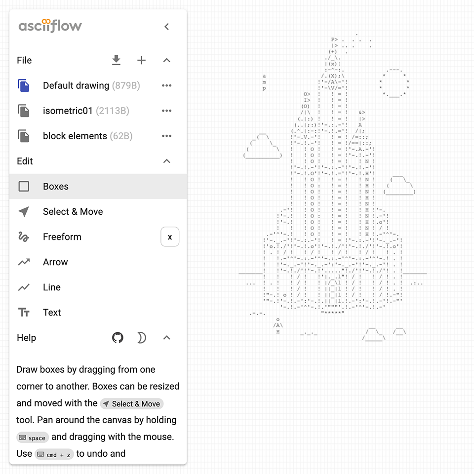
Other than that, a tool that fits my particular way of doing ASCII art is ASCII Flow, which you can use online or on your computer. I like the fact that you can select, copy and paste zones of a drawing, which other similar apps don't allow to. Like Markor, it's free and open-source.
Displaying ASCII art online
Disclaimer: if you're a web developer you can skip this section entirely.
Displaying ASCII art on a website can be a bit more tricky than it seems.
Browsers generally render text in a dynamic way, which means that any line (string) of text wider than the screen will be subject to line breaks. For ASCII art, this is bad news, because the pieces will lose their shape when the screen is narrow or the font size is large.
(Shortcut: download the final files from this ASCII web gallery tutorial from this link. If you know to know what's going on, please follow the tutorial below this message)
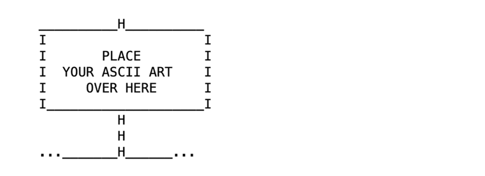
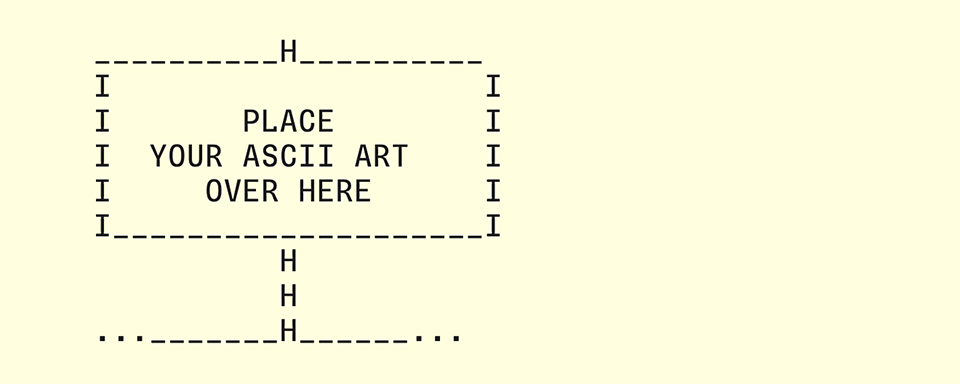
To avoid any undesired line breaks, we need to place our ASCII art piece inside of a tag that will display it as plain text, like in the following html code:
<!DOCTYPE html>
<html>
<head>
	<meta charset="UTF-8" />
	<meta name="viewport" content="width=device-width, initial-scale=1.0">
	<link rel="stylesheet" href="style.css" />
	<title>My ASCII art gallery</title>
</head>

<body>
<pre>

     __________H__________
     I                    I
     I       PLACE        I
     I  YOUR ASCII ART    I
     I     OVER HERE      I
     I____________________I
               H
               H
     ..._______H______...

</pre>
</body>
</html>
Copy the code above by clicking on the "copy" button. Paste it on a text editor (Notepad on Windows, TextEdit on Mac, vim or emacs in linux). Make sure that the text is plain text ("Format" menu -> make plain text on Mac's textedit, I don't know about the other editors). Save the file as a .txt file (for instance, "index.html"). Replace the .txt extension with an .html extension by renaming the file on your file explorer (you may see a warning, but ignore it). Double click on the html file to open it on a browser. Now you have a little static website to display your ASCII art. Nice!
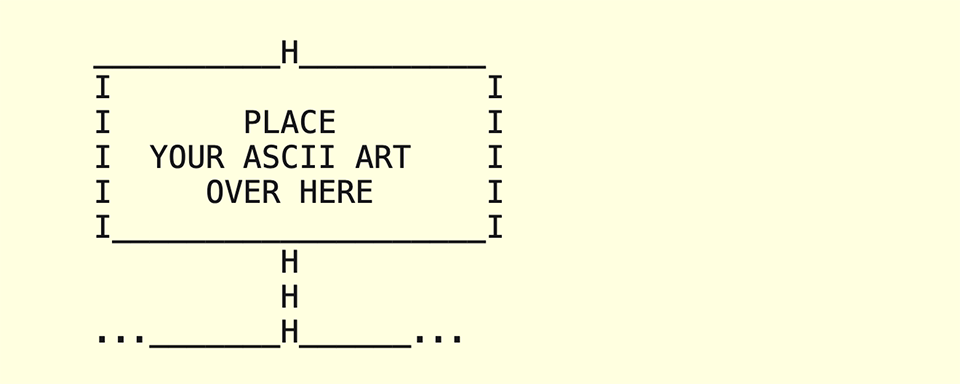
Your first ASCII gallery website should look like this, hopefully, on your browser.
Note: Using a "pre" tag on a ASCII art string means that the text lines will be shown in full, without breaking due to their width. If you have ASCII artworks with long strings of characters, this will mean that most likely the picture won't be shown entirely on a webpage, it will be cropped by the window of the browser, specially on narrow screens such as the ones on mobile phones. To avoid having cropped pictures, you can try to do ASCII pieces that aren't very large. If you know html, you can also create a div where you can place ASCII pieces than are larger than the browser's window, even if that would mean that they'd be cumbersome to look at on a mobile phone screen.
Alternatively, for large ASCII art pieces sometimes the best way to display them is as a picture (.png) or even as a vector file (.svg). Even if this particular practice kind of kills the purpose and nature of ASCII art, it can be a good compromise in order to better integrate ASCII art on websites which feature other kinds of content, like pictures or complex layouts.
Now that we've set the html code of your website, we can focus on writing some CSS to go with it. For beginners, CSS is a code that will apply stylistic features to the text and graphics of your website, generally included in a .css file that must be placed in the same folder as the html file of your website (unless you write a path that tells otherwise, but let's keep it simple for now). Here's a CSS file that can work nicely with the previous html we've generated:
body
{
  background-color: LightYellow;
  margin: 0 !important;
  padding: 0 !important;
  text-align: left;
}

*
{
  font-family: monospace, monospace;
  font-weight: normal;
}

pre {
  font-size: 16pt;
  line-height: 18pt;
  padding-top: 0;
  margin-top: 0;
  color: #17171a;
}
As before, copy the code above by clicking on the "Copy code" button. Paste it on a text editor (Notepad on Windows, TextEdit on Mac, vim or emacs in linux). Make sure that the text is plain text ("Format" menu -> make plain text on Mac's textedit, I don't know about the other editors). Save the file as a .txt file (in this case, "style.css"), in the same folder that you saved your "index.html" file previously. Replace the .txt extension with an .css extension by renaming the file on your file explorer (you may see a warning, but ignore it). Now, if you open your "index.html" file again on a browser, you should see that the font display size is slightly bigger, and that the background of the page is light yellow (you might need to reload the page if the changes don't appear straight away).
Currently, your website should look like this. If it doesn't, kindly reload the page or check for any typos in the names of the files.
Important note: the html code that I provided above points to a file called "style.css" that must be contained in the same folder as the "index.html" file in order to work. If you want to use a different name for the css file or a different folder location, please modify the path name in the <link rel="stylesheet" href="style.css" /> section of the html code.
Not important note: "monospace, monospace" in the font-family property is not an error, there's a reason for it.
If you want to choose a custom monospace font to display your art, other than the default monospace font of the computer or phone used to see your website, there's an option for that. First, create a folder called "fonts" inside the folder where you have your html and css files. Then, download a monospace font from an open-source foundry, in this particular case we're going to use Sligoil.
Afterwards, you can extract the files from the .zip package and carefully place the "Sligoil-Micro.woff" file (found on the Sligoil-main/fonts/web folder) inside the "fonts" folder that we created earlier.
You can then set the CSS of your page like in the code below (just replace the code on your CSS file):
body
{
  background-color: LightYellow;
  margin: 0 !important;
  padding: 0 !important;
  text-align: left;
}

@font-face {
  font-family: 'sligoil';
  src: url('./fonts/Sligoil-Micro.woff');
  font-weight: normal;
  font-style: normal;
}

*
{
  font-family: 'sligoil', monospace, monospace;
  font-weight: normal;
}

pre {
  font-size: 16pt;
  line-height: 18pt;
  padding-top: 0;
  margin-top: 0;
  color: #17171a;
}
Now, reload your index.html website in the browser to see the new font choice come to life.
Finally, your website should look like this (the Sligoil Micro font has replaced the generic monospace font of the previous iteration). If it doesn't, kindly reload the page or check for any typos in the names of the files.
You can add your ASCII art to the html file, further customize the look of your website by editing the CSS file, or replace Sligoil by any other monospace font (for that, remember to place the .woff files of your font of choice in the /Fonts folder, and replace "Sligoil" for the name of your font files on the CSS file). If your ASCII gallery displays correctly on your computer, you can upload it to a hosting server and publish your gallery online. Congratulations!
Reminder: If you're lost or all else fails, you can download the files of this ASCII web gallery tutorial from this link.
Html character entities
One last important note for displaying ASCII art online: some symbols (namely <, >, ", and &) that are contained in the ASCII character set won't be rendered correctly when displayed on a html website, when they're placed inside of a "pre" tag. This happens because they're usually reserved to define elements and attributes. In order to display them accurately inside of a "pre" tag, you need to replace them for some special codes known as html character entities.
In practice, in the html code of your website, inside your "pre" tag, you need to replace:
< for < > for > " for " & for &
This way, each symbol should appear correctly on every browser. Cheers!
Web accessibility
Illustrations depicted as ASCII art have the advantage of providing a very lightweight alternative to traditional image formats (.png, .jpeg, .webp or .avif files) that are more commonly used on the web. One of their perks (for that particular use) is that visually impaired visitors who would like to make sense of ASCII images (by using a screen reader) would have a hard time trying to extract the meaning of the seemingly random character strings that constitute them.
In the modern web, pictures rendered as pixels can be made accessible for this users by adding "alt text" to them, which means using the "alt" html tag and including a written description of the artwork inside of the tag. Another (probably more practical) solution that I've seen online is simply adding a written description of an ASCII artwork, in a paragraph tag, placed just below it.
Example:
............\
......><((((((o)H)
............/
Description: A three-line ASCII art illustration of a swimming fish, with flippers and a round eye.
Animations
It is actually possible to render ASCII art "hand-drawn" animations on a website that are entirely text-based, by using Javascript to flip through the frames of the animation. Since this falls outside of the scope of this tutorial, I leave you with this partially-broken ASCII Animation tutorial by llizard. I've also found this CodePen code by Alan Thompson which might be interesting. Research in progress, as they say.
Artist Harmonie Aupetit uses the gif image format as a mean of displaying her ASCII animations online. The only perk of this format is that its size bulks ups very fast if you want to render an animation with a large (size and height) resolution, or that contains many different frames. But it works quite well for short, simple animations.
Displaying ASCII art on print media
Printing ASCII art pieces is not very different than presenting them online, just remember using a monospace font that feels appropriate to the subject. One subtle detail that makes all the difference, though, is that sometimes when typesetting ASCII art on a layout editor (such as Indesign or Scribus), the lines of text that compose the piece may feel disconected, depending on the text style that's being applied to that particular paragraph.
To avoid having white lines inside of the picture, a good practice is using what is called in French "composition carrée" (square typesetting), which is simply setting the same value for the text size (in points) as for the leading. This should give ASCII pictures their necessary visual density.
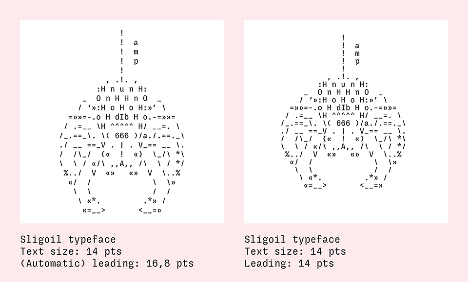
Square typesetting, much better. You can adjust the leading values according to your liking, but they should be consistent across a series of ASCII illustrations.
Conclusion
And here arrives the end of this tutorial, which equates to (approximatively) the total sum of my knowledge about making ASCII art. As we have seen, ASCII is an affordable form of art that relies on strong, commonplace technologies of the modern internet (plain text, html, css). It can be made on all sorts of digital devices, including vintage ones. Even if it largely developed online, its static forms can be reproduced in printed media without particular limitations.
If you've read this far and found this article useful, please consider buying me a proverbial coffee (or any other hot beverage your imagination can conjure, I don't really like coffee that much). Happy drawing!
Selected articles about ASCII art
A short history of text encoding systems, from ASCII to Unicode, by Javier Tiniaco Leyba.
Development of (ASCII) Text Art, a comprehensive text by Joan G Stark.
A history of ASCII art, on the ASCII art archive.
The Glyphs Drawing Club blog , by Heikki Lotvonen, is a true mine of ASCII-related in-deep articles.
Another history of ASCII art, written by Adel Faure (published on Velvetyne's website).
Selected ASCII artists directory
• [Self insert] My own ASCII galleries of 2024 and 2025
More ASCII art tools
ASCII Studio, an online ASCII editor with colour support.
REXPaint, an ASCII and ANSI editor with colour support for Windows and Linux (free and open-source).
Moebius, an ANSI editor for MacOS, Linux and Windows (free and open-source).
Collective projects and experimental tools
Fungi, a collective art project initiated by Polyducks, using the jgs font.
ASCII Automata, a generative experiment by Heikki Lotvonen.
Glyphs Drawing Club, an ASCII-based drawing tool by Heikki Lotvonen.
textmode.art, a tool for creating dynamic text-based art presentations.